Appendix: AKS Sizing
This section details the results from a performance analysis of an installation in AKS (Azure Kubernetes Service).
This appendix records a past AKS performance study. Current Kubernetes deployments use Kubernetes Sizing Buckets. Those buckets assume 8-core, 64 GB AKS nodes.
To analyse the results we look at two measures of the performance of the DSE: margin proportion over time and travel duration proportion over time.
The DSE produces plans that are given a score, called the plan margin. This is calculated by giving positive scores for each activity allocated, with the costs (e.g. travel, resource shift time) then subtracted. The margin proportion at any given time is the plan margin at that time divided by the maximum margin achieved across the batch of tests. This gives a value between 0 and 1, that should be increasing over time since the plan margin will never decrease over time, as the DSE is always looking to improve this score.
The travel duration proportion is the average travel duration from the plan, divided by the minimum average travel duration (measured at a late-time of the test to ensure that transient behaviour was excluded and that allocations had reached a steady-state.)
The shape of the graphs produced can be viewed in two phases. The first phase is dominated by allocations, resulting in a sharp growth in the plan margin. Once the number of allocations begins to settle down, the second phase is one where the DSE is mainly reducing travel costs and resource usage. This gives a shallower slope to the curve. For the travel duration graphs, during the first phase, the average travel duration can remain high and in some cases can actually rise due to additional allocations. However, once allocations settle down the DSE will predominantly improve the schedule by reducing travel costs.
Test Setup
The setup will be the same across all tests, unless stated otherwise (e.g. variations made for comparison tests).
The cluster was given 10 nodes of type Standard_D4_v4, which each have 4 cores and 16Gb RAM. A single S3 SQL Azure database was used for both the System and Scheduling schemas, and a vCore GB HTM v3 was used with a minimum cores of 0.5 and a maximum of 4. These two databases were shared amongst all running pods.
The role application instance counts used were as follows:
| Application | Instance Count |
|---|---|
| DSE | 5 |
| ABE, DSP, SBM, SQM | 3 |
| Other | 1 |
Five datasets were then loaded into the system, each with 15000 activities. Each test ran for an hour and was performed five times, providing a sufficient sample size to allow averaged results to be used with statistical uncertainties in the region of 5% or less. The results presented in all graphs are averaged out across all of the runs for each test.
Dataset Size Comparison
Tests were performed to study the impact of varying the dataset size on the performance of the system. Values adopted were:
- 10000 activities
- 15000 activities
- 25000 activities
For each test, five datasets were processed at the same time. An S3 database was used for the system and scheduling data. The HTM database was configured to use a vCore database with the minimum cores set to 0.5 and maximum cores set to 4.
Margin Proportion
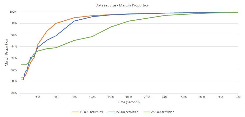
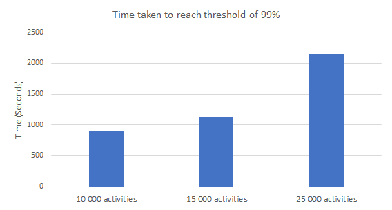
The plan margin graphs shows the time taken to improve the margin increases linearly with the number of activities. We expect the 25000 activity dataset to take longer due to the larger amount of data needing to be processed.
Travel Duration Proportion
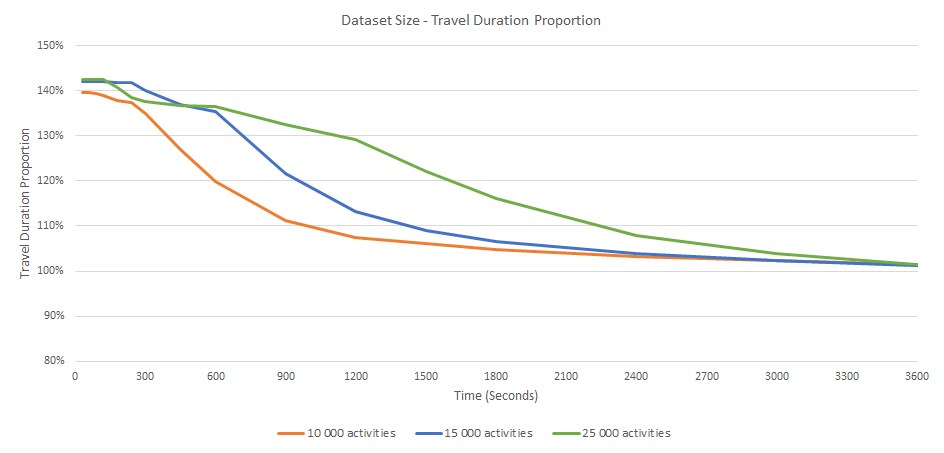
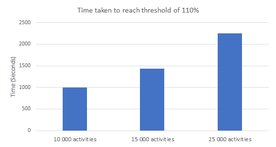
The travel duration graphs show that the time taken to reduce travel durations increases linearly with the number of activities.
Dataset Count Comparison
Tests were performed to study the impact of varying the dataset count on the performance of the system. To accommodate the number of datasets being tested, systems of different sizes were used. The following table shows the number of application instances used and database sizes as the number of datasets was varied.
| Test | Node Count | DSE Count | Other App Count | DB | HTM DB |
|---|---|---|---|---|---|
| 1 dataset | 3 | 1 | 1 | S3 | Min: 0.5 vCore, Max: 4 vCore |
| 5 datasets | 10 | 5 | 3 | S3 | Min: 0.5 vCore, Max: 4 vCore |
| 10 datasets | 20 | 10 | 5 | S3 | Min: 0.5 vCore, Max: 4 vCore |
| 10 datasets (DB Increase) | 20 | 10 | 5 | S4 | Min: 1 vCore, Max: 8 vCore |
For each test a dataset of 15000 activities was used.
Margin Proportion
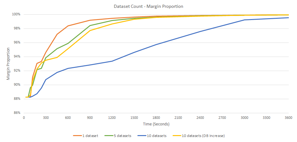
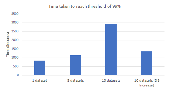
The plan margin graphs show there is not much difference between 1 dataset and 5 datasets. The jump to processing 10 datasets adds a considerable amount of time to get to higher plan margins.
This jump when processing 10 datasets is due to the increased load on the databases when the datasets are being loaded at the same time. This is especially true for the HTM database where the routing data must be loaded before scheduling can start. Increasing the database sizes brings the results back in line with the other tests. This shows that the performance of the system scales well as the number of datasets is increased, provided that the database is not overloaded. This is demonstrated by a comparison of the results for tests "10 Datasets" and "10 Datasets (DB Increase)". To improve the performance, the advice is to stagger the loads when inputting to allow one dataset to be fully loaded before the next begins.
Travel Duration Proportion
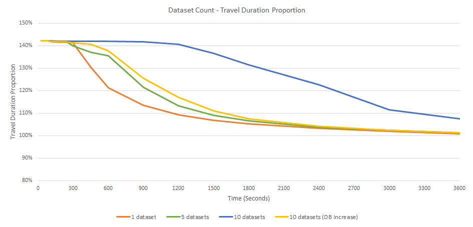
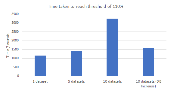
The travel duration graphs also show there is not much difference between 1 dataset and 5 datasets. The jump to processing 10 datasets adds a considerable amount of time to reducing the travel durations. Similar to the margin proportion results shown above, this jump can also be attributed to the overloaded databases.
HTM Performance with 10 Datasets
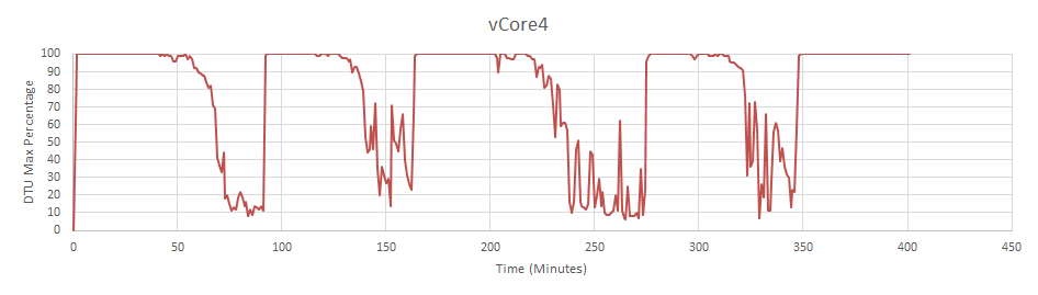
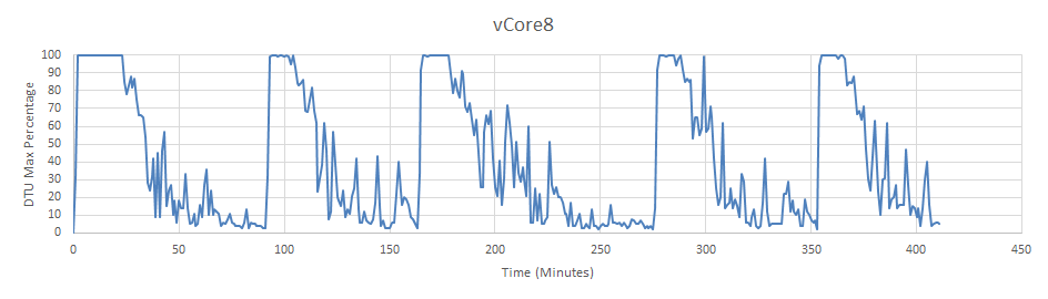
The above graphs show the CPU usage of the HTM database while running the 10 dataset tests. The graphs show that the vCore HTM with a maximum of 4 vCores is overloaded. Increasing the database to have a maximum of 8 vCores alleviates the problem. This again highlights the importance of correctly sizing the HTM database for the data being processed.
Database Size Comparison
Tests were performed to study the impact of varying the database size on the performance of the system. Values adopted were:
- S2
- S3
- S4
Five datasets were processed at the same time, each with 15000 activities. The HTM database was configured to use a vCore database with the minimum cores set to 0.5 and maximum cores set to 4.
The graphs below show the maximum DTU percentage over time while the tests were running. At the start of each of the five runs you can see a peak in the graph where the initial load is being read. There is then a quite period where data is being retrieved from the HTM and an initial plan is being generated. Another high peak then happens as the initial plan is saved to the database. During the test run there are further smaller peaks as the plans changes are saved to the database.
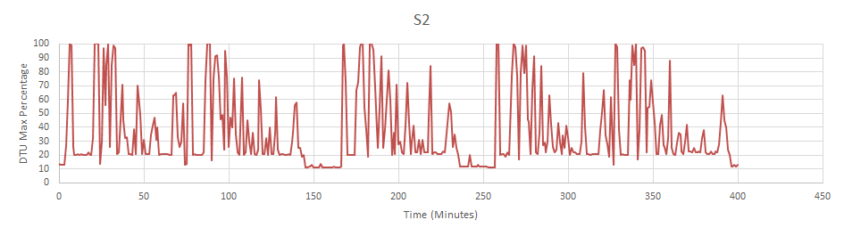
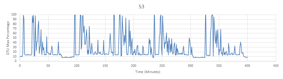
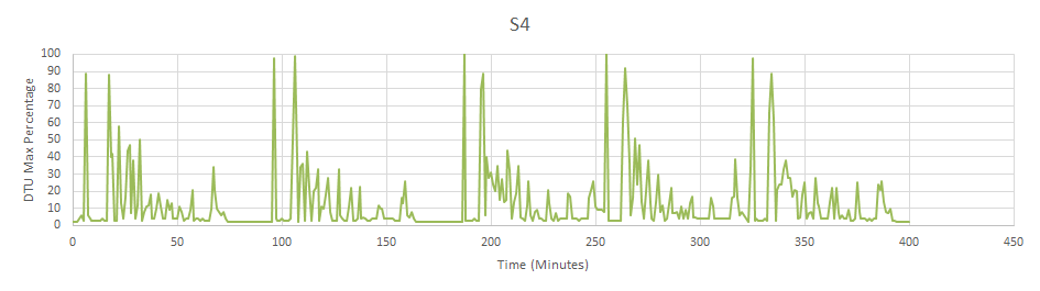
The graphs show that there is a background database usage level while the applications are running. This is around 20% for S2, 10% for S3 and drops to around 2% for the S4. The peaks are also lower with the S4 barely needing to go to 100% where the S2 is consistently hitting it.
HTM Database Size Comparison
Tests were performed to study the impact of varying the HTM database size on the performance of the system. Values adopted were:
- No HTM
- S3
- S4
- vCore4 Serverless (Minimum: 0.5 Core, Maximum: 4 Core)
Five datasets were processed at the same time, each with 15000 activities. An S3 database was used for the system and scheduling data.
Margin Proportion
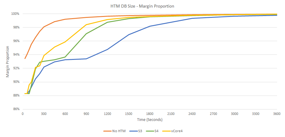
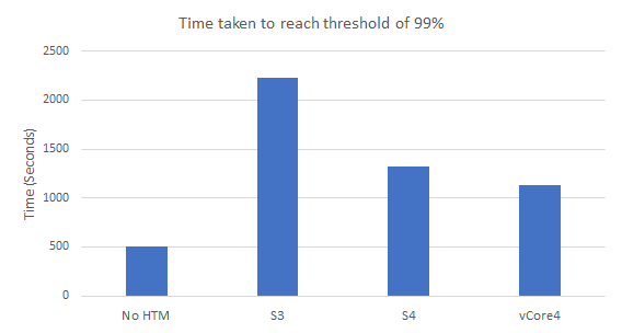
The plan margin graphs show that the HTM database performance has a large effect when loading datasets. The better the HTM database performance the faster the plan margin will reach a high value.
Travel Duration Proportion
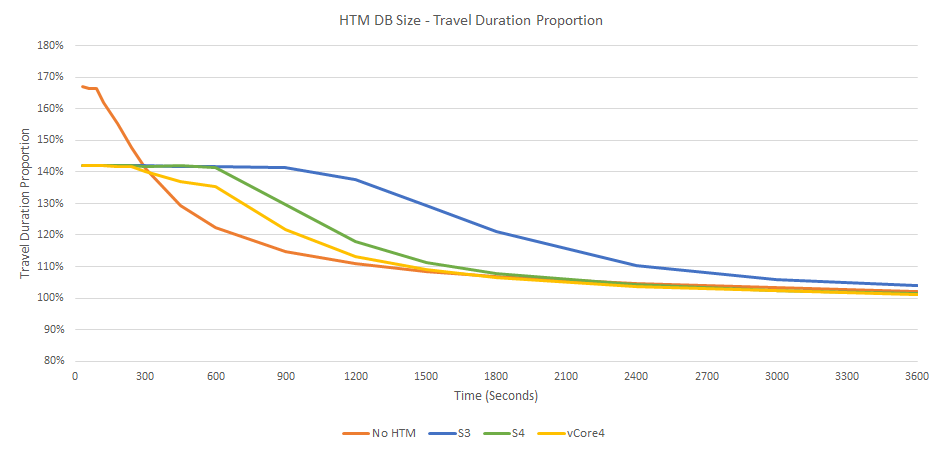
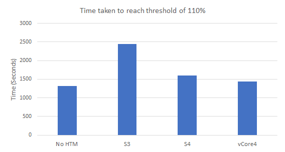
The travel duration graphs are closer than the plan margin with the S3 database still lagging behind. Improvements to travel duration are usual after the plan margin has stabilized so we would expect less of an effect here.
Using the vCore Serverless option allows the HTM database to have the best performance for dataset loads and to scale down after the load is done when the database is less used.
HTM Database Usage
The graphs below show the maximum CPU percentage over time while the tests were running. At the start of each of the five runs you can see a peak in the graph where the initial load is being processed. During the test run there are further peaks as additional travel calculations are needed during scheduling
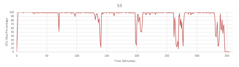
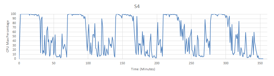
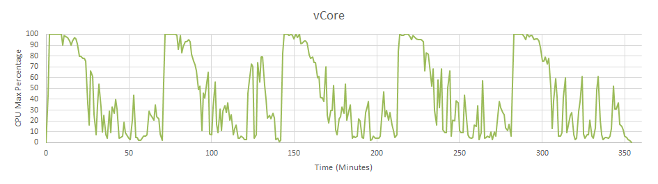
The graphs show that the S3 struggles to keep up and spends all its time at 100% CPU usage. Both the S4 and vCore have a high initial period where lots of CPU is being used to get the travels for the initial load. This initial processing period is the smallest for the vCore.
Node Size Comparison
Tests were performed to study the impact of varying the Kubernetes node size on the performance of the system. Values adopted were:
| Node | Node Count | DSE CPU Requests | Notes |
|---|---|---|---|
| Standard_D4_v4 4 Core, 16 GB | 10 | 3.5 | Each DSE effectively gets its own node. Guaranteed 3.5 cores, can use up to 4. |
| Standard_D8_v4 8 Core, 32 GB | 5 | 3.5 | Each DSE effectively gets half a node, any remaining un-used CPU can be used by the DSE. Guaranteed 3.5 cores, can use up to 8. |
| Standard_D8_v4 8 Core, 32 GB | 8 | 7 | Each DSE effectively gets its own node. Guaranteed 7 cores, can use up to 8. |
Five datasets were processed at the same time, each with 15000 activities. An S3 database was used for the system and scheduling data. The HTM database was configured to use a vCore database with the minimum cores set to 0.5 and maximum cores set to 4.
Margin Proportion
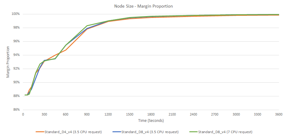
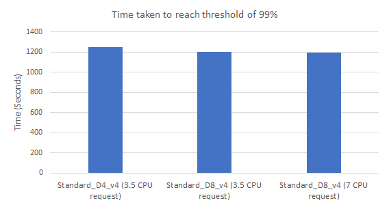
The above graphs show there is no significate difference to the plan margin between using a 4 core node and using an 8 core node.
Travel Duration Proportion
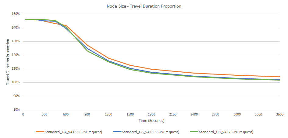
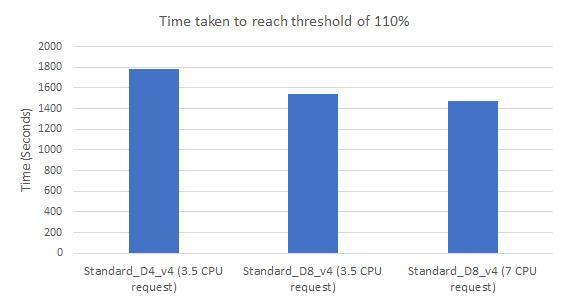
The above graphs show there is no significate difference to the travel duration proportion between using a 4 core node and using an 8 core node. The 8 core nodes slightly push ahead at the end due to having the extra CPU power. The gain in performance here is not worth the extra cost of having an extra 3 nodes for the DSEs at 7 CPU request.
Using 5x 8 core nodes with the DSEs at 3.5 CPU request may be beneficial since the cost is the same as 10x 4 core nodes but allows the DSE to use any spare CPU not being used on the node. Using 8 core nodes also has the added benefit that it makes the allocation of pods to nodes by Kubernetes simpler by providing more room to fit the CPU and memory requests.
Kubernetes vs Standard
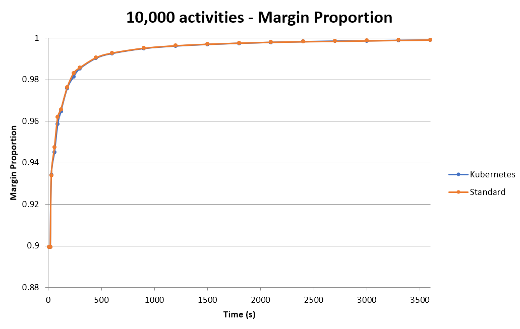
The results from a performance comparison between a standard install and Kubernetes are shown in the above chart. The tests used a 10,000 activity dataset with each curve representing an average over a batch of 10 tests so as to reduce variance. The chart shows there is no significant performance difference between an installation running on Kubernetes and an installation running on Windows.
Conclusions
- Use vCore Serverless for HTM databases
- Consider using a few 8 core large nodes rather than many 4 core small nodes
- When processing many datasets, stagger the loads to avoid CPU throttling from the database impacting the plan processing time. Alternatively, if plans must be processed simultaneously, increase the size of the database appropriately to match the number/size of datasets being processed.