Appendix: Azure Sizing Metrics
This section details the results from a performance analysis of an Azure PSO system. The tests were performed against a single tenant system and against multi-tenant systems containing both five and ten tenants. Each tenant was running a single dataset containing between 10,000 and 25,000 activities.
Note
Please note that the performance will be primarily affected by the number of datasets being processed, and the size of those datasets. For example, the results for a 5 tenant multi-tenant system will be equivalent to the results expected for a single tenant system running 5 datasets of the same size.
Baseline Setup
The baseline setup used for each of the tests will be described here. The setup will be the same across all tests, unless stated otherwise (e.g. variations made for comparison tests).
Each test was performed against a standard Azure deployment, with the DSE given its own role with the remaining services hosted on an Interface role. The exact setup for the roles is described here:
| Role | Installed Services |
|---|---|
| DSE | DSE, SSM |
| Interface | ABE, ADM, DST, GWY, SBM, SIM, SMM, SQM, SSM, SWB |
The number of instances of the DSE and Interface roles were varied depending on the number of organisations in the test. This reflects a deployment that has scaled out, adding more DSE and Interface instances to cope with the increased number of datasets. The instance count used was as follows:
| Organisations | No. of DSE Instances | No. of Interface Instances |
|---|---|---|
| 1 | 1 | 1 |
| 5 | 5 | 3 |
| 10 | 10 | 5 |
The baseline setup was as follows. Each Azure instance used was an Azure Standard_D4_v2, which has 8 cores and 28Gb RAM. For each deployment, a single S3 SQL Azure database was used for both the System and Scheduling schemas, and an S4 GB HTM was used. These two databases were shared amongst all roles and instances in the deployment.
Each test ran for an hour and was performed at least 10 times, providing a sufficient sample size to allow averaged results to be used with statistical uncertainties in the region of 5 percent, or less.
In later sections, we explore variations made to the baseline setup to explore any impact made to the performance.
Initial Results
To gather the initial results, the number of organisations used was varied, testing the performance with 1, 5 and 10 organisations. Three different datasets, containing 10,000, 15,000 and 25,000 activities, were used per organisation. For each test, the data sent to each organisation is identical, but is processed separately for each organisation.
To analyse the results we look at two measures of the performance of the DSE: margin proportion over time and travel duration proportion over time.
The DSE produces plans that are given a score, called the plan margin. This is calculated by giving positive scores for each activity allocated, with the costs (e.g. travel, resource shift time) then subtracted. The margin proportion at any given time is the plan margin at that time divided by the maximum margin achieved across the batch of tests. This gives a value between 0 and 1, that should be increasing over time since the plan margin will never decrease over time, as the DSE is always looking to improve this score.
The travel duration proportion is the average travel duration from the plan, divided by the minimum average travel duration (measured at a late-time of the test to ensure that transient behaviour was excluded and that allocations had reached a steady-state.)
The shape of the graphs produced can be viewed in two phases. The first phase is dominated by allocations, resulting in a sharp growth in the plan margin. Once the number of allocations begins to settle down, the second phase is one where the DSE is mainly reducing travel costs and resource usage. This gives a shallower slope to the curve. For the travel duration graphs, during the first phase, the average travel duration can remain high and in some cases can actually rise due to additional allocations. However, once allocations settle down the DSE will predominantly improve the schedule by reducing travel costs.
The results presented in all graphs are averaged out across all of the runs for each test. The standard deviation has been calculated to estimate the error, with errors less than 4% in all cases. As such, error bars have been omitted from the graphs presented.
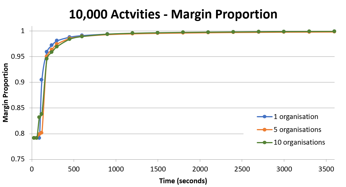
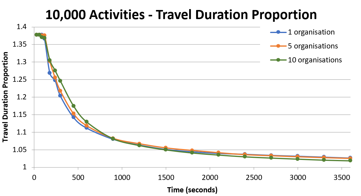
The above graphs show the margin proportions and travel duration proportions for the 10,000 activity dataset, running with 1, 5 and 10 organisations.
Across the entire graph, there does not appear to be much difference in the performance here when varying the number of organisations, although with fewer organisations the performance is slightly better in the first few minutes. This is potentially due to the way all of the tests begin running at the same time, all making use of the same databases.
The graph below shows the times taken to reach particular thresholds for each organisation count: using the time taken for the margin proportion to reach 99%, and the time taken for the travel duration proportion to decrease to 110%.
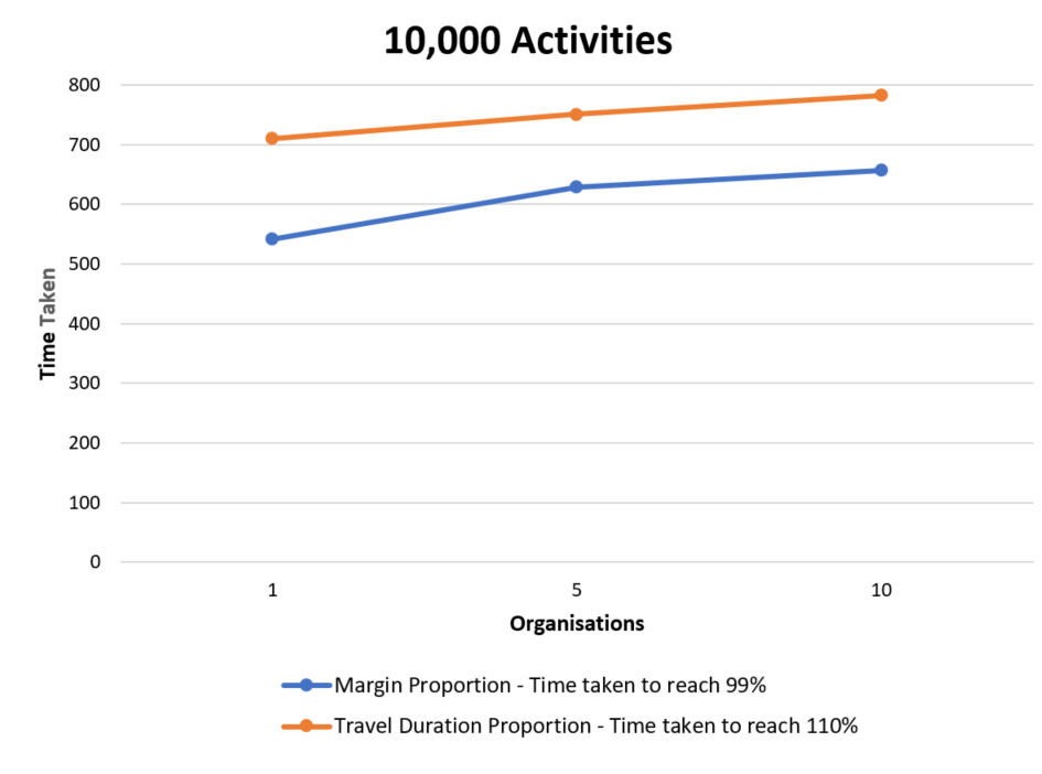
Here we see a fairly small increase in time to reach the desired thresholds as the number of organisations increases. For the margin proportion, the increase from 1 organisation to 10 results in a 21.2% increase in the time, and for the travel duration proportion the increase is just 10.1%.
Changes to Database Tiers
Increasing a database performance tier, increases the database's permitted CPU usage, memory, and reads/writes. A database with an insufficient performance tier for the workload can throttle the DSE's performance. This benchmarking analysis aims to probe the lower bound of what we need to run a multi-tenant system without any impact from this throttling.
There are two databases in use for these tests. All PSO schemas used are in the first database (which is the Scheduling schema and the Scheduling System schema, for these tests). The travel data is then stored in the HTM database. These databases are independent and can be set to different performance tiers.
This section contains the results from tests where the performance tiers for the two databases have been varied.
Lowering PSO Database to S2
Tests were attempted for 10 organisations with an S2 database used as the database for the System and Scheduling schemas, however this reached the limit for concurrent requests allowed at this database tier. It is therefore not possible to use a database as small as an S2 with 10 organisations.
Lowering HTM Database to S3
The tests for 10 organisations were repeated with an S3 HTM database, for all three datasets: 10,000, 15,000 and 25,000 activities. It was found that this change lowered the performance significantly across all of the datasets. The graphs below shows the results for the margin proportion and travel duration proportion, running the 25,000 activity dataset with an S3 HTM database, for 1, 5 and 10 organisations.
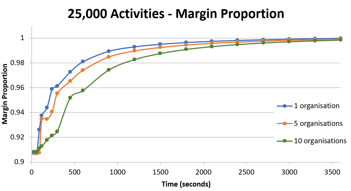
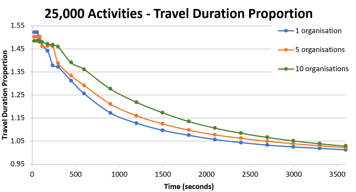
These graphs demonstrate that an S3 database tier for the HTM is not recommended for 10 organisations, due to the evidently poorer results when the number of organisations is increased, which is caused by an increasing impact of database throttling as the workload is increased. See section 'Effect of Varying Dataset Size' for the details of the 10,000 and 15,000 activity results.
The next graph plots the margin proportion for 25,000 activity dataset, running on 10 organisations, for: no HTM, an S3 HTM, and an S4 HTM.
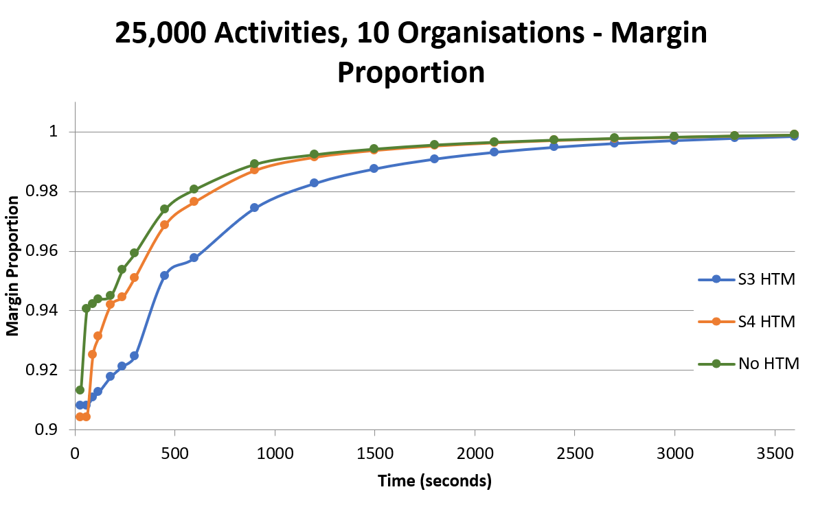
The graph above clearly shows the negative impact of using an S3 database for the HTM compared to using an S4 database, and we can see that the performance with the S4 is very close to the performance without an HTM.
The threshold graph for the 25,000 activity dataset with an S3 HTM can be seen below, showing the times taken for the margin proportion to reach 99%, and the time taken for the travel duration proportion to decrease to 110%.
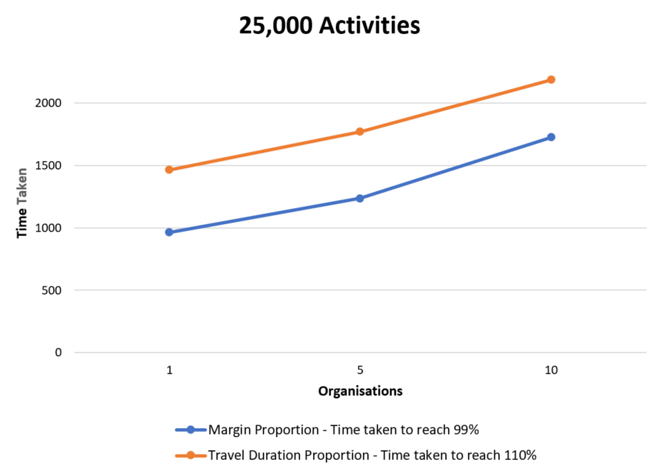
Here we see a much more significant increase in time to reach the desired thresholds as the number of organisations increases. When increasing from 1 organisation to 10, for the margin proportion, the time rises by 79.1%, and for the travel duration proportion the time rises 49.2%. For comparison, these statistics were 21.2% and 10.1% respectively for the S4 HTM (though, this result was for the 10,000 activity dataset).
It was noticed for these tests that the CPU usage for the HTM database was indeed quite high with 10 organisations, supporting the idea that the HTM performance tier could throttle the performance with an increased number of organisations.
Changes to Machine Size
The tests for 10 organisations (with all three datasets) were repeated on an Azure Standard_D3_v2 machine, which has 4 cores, and the results were compared to the initial results (which were performed on an Azure Standard_D4_v2 with 8 cores).
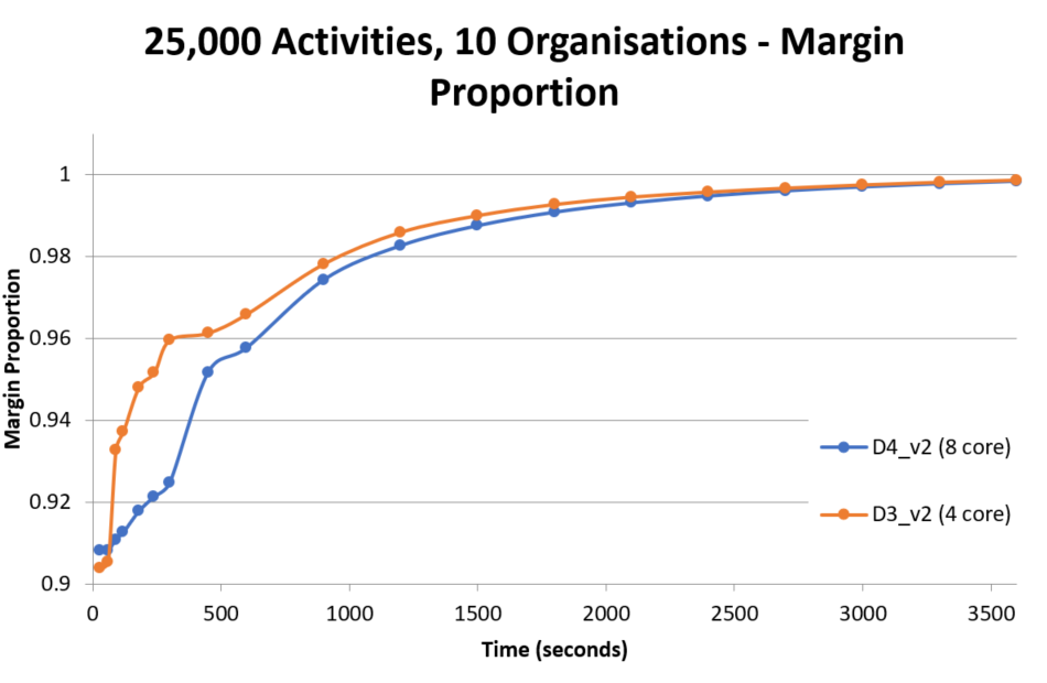
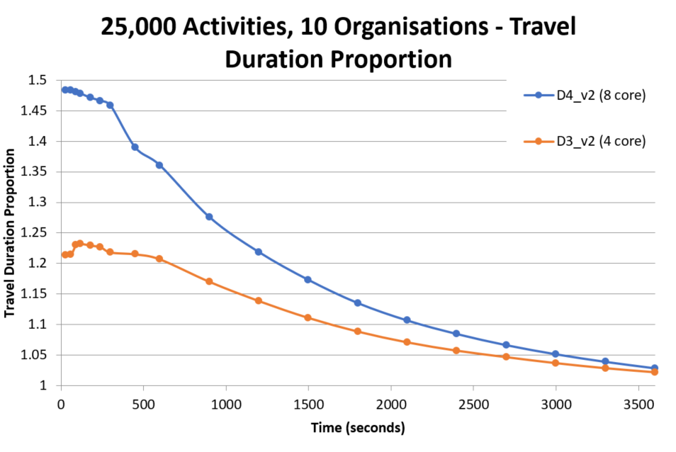
The above graphs compare the results from a 25,000 activity dataset using a 4 core and 8 core machine. Interestingly, the performance appears better using the 4 core machine, indicating that good results can be obtained with a potential cost saving. This result does warrant further investigation with more complex data to assess whether this relation holds, however, it is a promising result nonetheless.
Effect of Varying Dataset Size
Tests were carried out varying the dataset sizes (between the 10,000, 15,000 and 25,000 activity datasets), to see how much of an impact the increased workload would have when running on a multi-tenant system.
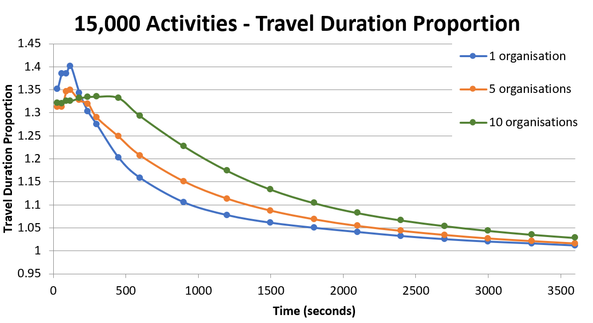
The following graphs show the results for the 15,000 and 25,000 activity datasets when running with an S4 HTM.
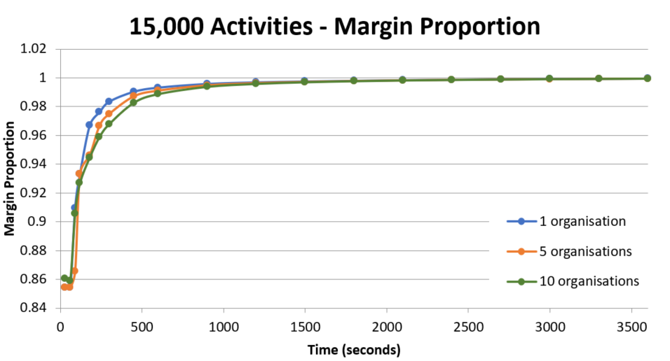
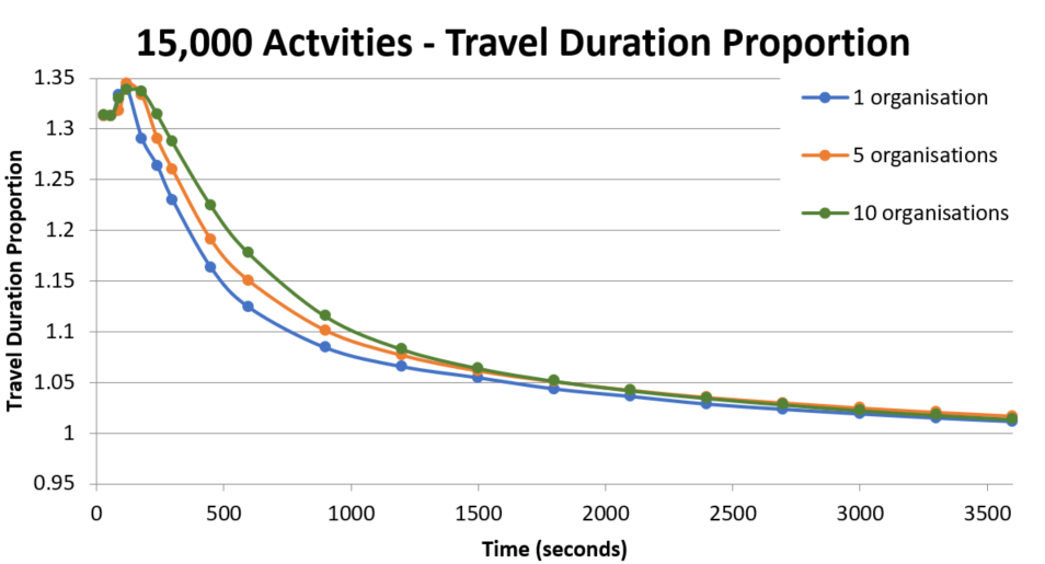
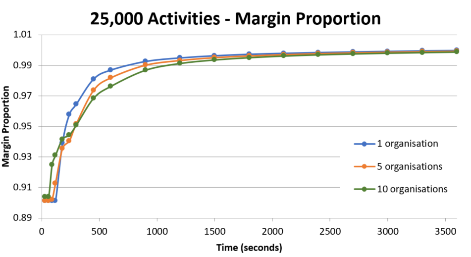
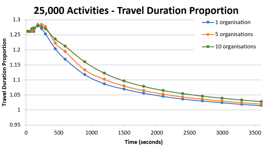
Note that the increase in the travel duration proportion at the start of the test runs is expected, as the number of allocations made may still be growing at this point. It is only really the travel duration proportion after this point, when it starts to decrease, that is of interest.
These graphs do indicate that as the dataset size increases, there is slightly more of an impact on the performance as the number of organisations increases, due to the increased workload. It is worth noting at this point, that all organisations begin running the dataset at the same time in each test, and with a shared database, this could explain why there is a slower performance with more organisations towards the start of a test run.
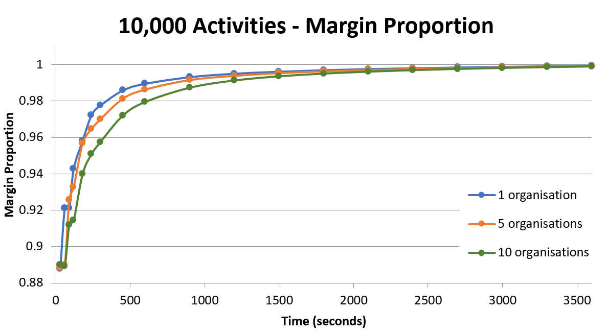
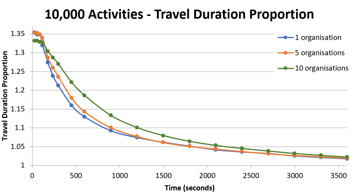
The next sets of graphs show the results from running the 10,000 and 15,000 activity datasets with an S3 HTM (the results for the 25,000 activity dataset can be found in section 'Lowering HTM Database to S3').
Here are the graphs for the results from 10,000 activities (running with an S3 HTM):
Here are the graphs for the results from 15,000 activities (running with an S3 HTM):
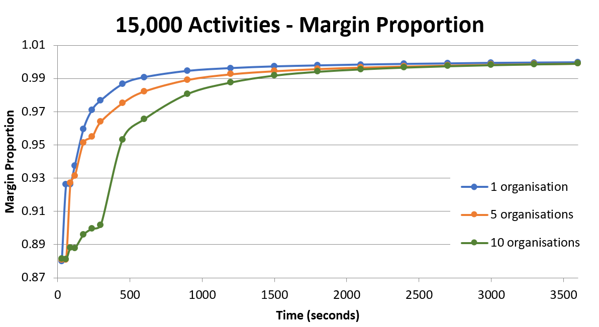
These graphs strengthen the suggestion that an S3 HTM is not ideal for 10 organisations, with the negative impact still remaining present as the dataset size is decreased. This impact is, however, noticeably smaller with the 10,000 activity dataset.
Overall, there is an impact to performance with more organisations within the first few minutes, however, beyond this time the performance seems to be largely unaffected.
Conclusions
Overall, there is a small difference in the performance when increasing the number of organisations, possibly due to the way the tests all start running at the same time. For 10,000 activities, this difference was found to be at the level of around 15% percent when increasing the number of organisations tenfold, and is therefore sufficiently small to be essentially negligible to the client organisation.
It was found that an S2 database for the System and Scheduling schemas is too small with 10 organisations. We recommend an S3 database for use with 10 organisations and with 5 organisations, and an S2 with 1 organisation.
Large differences in the performance seem to occur when the HTM in use has reached maximum capacity (i.e. maximum DTU usage and/or sessions), and it appears that while an S3 HTM will work for 10 organisations, it is not recommended, and a much better performance can be obtained with an S4.
Furthermore, tests that compare a 4 core VM with an 8 core VM show that the 4 core machines are seemingly viable for 10 organisations, with this result remaining true for all of the sizes of datasets tested.