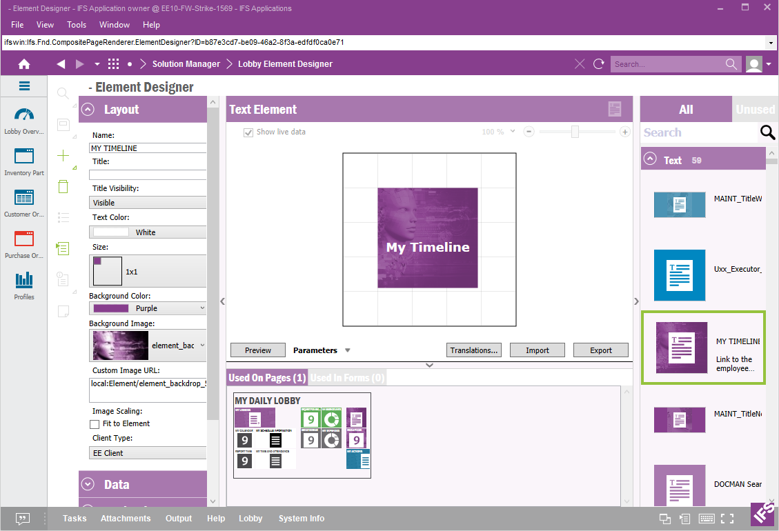
The element designer allows you to create new and configure elements. The tools has four areas. The Properties, the Preview, the Element Browser and the Used On.
There are a lot of properties that can be set on an element. They are divided
into groups, Layout, Data,
Navigation, Formatting, Form Mapping and
Information.
The Layout, Form Mapping and Information looks the same for all elements but the rest are
dependent of the element type.
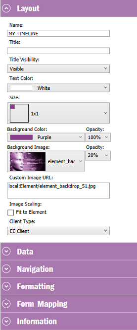
These properties are common for all element types
| Property | Description |
|---|---|
| Name | The name of the element |
| Title | The element title. Searchable in the Element Browser |
| Title Visibility | Shows/hides the title. |
| Text Color | The color of the element text |
| Size | The size of the element |
| Background Color | The color and opacity of the element background |
| Background Image | The elements background image and it's opacity |
| Custom Image URL | The Url to a store image. remember to set the access so everyone can reach it. |
| Client Type | The type of Client the element is meant to be used in. |
These properties are common for all element types
| Property | Description |
|---|---|
| Choose Forms | Choose which forms the element should be mapped to |
| Form | Select a form to make mappings |
| Enabled | Enable the mappings |
| Column parameter | Map view column to element parameter. If the column is missing in the list, try to use custom. |
These properties are common for all element types
| Property | Description |
|---|---|
| Author | The author of the element. Searchable in the Element Browser. |
| Keywords | Element keywords. Searchable in the Element Browser |
| Descriptive Text | Description of the element. |
| Last Modified | The date when the element was last modified. |
| Copied From | If derived. The element which this element was a copy of. |
| Presentation Object | This elements presentation object id. |
| Protect Configuration | A way to mark the element protected to show others that they should make a copy and make the changes to that copy. |
This section is useful to verify whether the created Element is working properly. Using the "Preview" button, it's possible to run the element's Data Source query and check whether the element shows the set of data that's received. There can be some Data Sources which includes Parameters. Using the "Parameters" drop down it's possible to change the values of the parameters and preview the element.
If a Time Slicer is applicable to an Lobby Element's Data Source a preview Time Slicer is shown and can be used for testing in the Preview section.
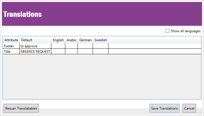
Translations of texts can be made by using the "Translation" button. See more about Translations here.
Elements can be exported to XML do that by using the "Export" button. Elements can also be imported do that by using the "Import" button.
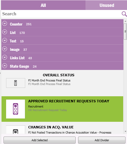
The Element Browser shows all elements in the repository. Each element type has it's own section, the section consist of the element type name and the number of elements in that section. To select an element click on the element in the Element Browser. The selected element will now be opened in the Element Designer. A section can be expanded and collapsed by clicking the arrow to the left of the section name. All sections can be collapsed by using the right mouse button option "Collapse All".
The Element Browser has two options, to show all elements or to show all unused elements. This choice can be made by selecting the "All" section or the "Unused" section in the top of the Element Browser.
The Element Browser has an option to search for all types of elements. To search for an element, type the search criteria in the search textbox. The search result will be shown instantly. The search functionality has the following search criteria:
If the selected element is used on a Page this Page will be shown here. Navigation to the Page is possible by double clicking the Page.