Element Designer
The element designer allows you to create new and configure elements. The tools has three areas. The Properties sections, the Preview and the Element Browser.
Properties Sections
There are a lot of properties that can be set on an element. They are divided into groups, Layout, Data, Navigation, Formatting and Information.
The Layout, Form Mapping and Information looks the same for all elements but the rest are dependent of the element type.
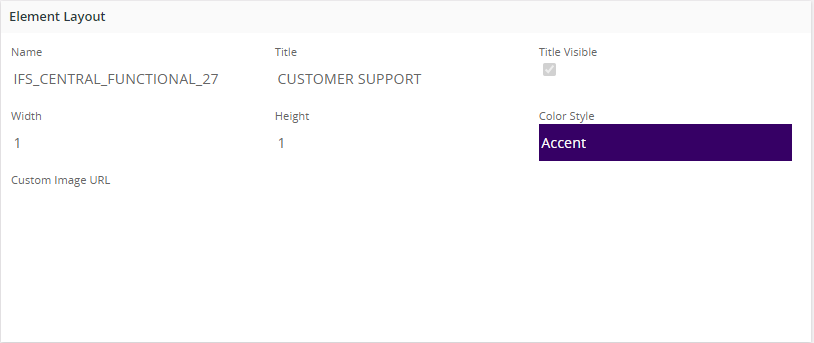
Layout
These properties are common for all element types
| Property | Description |
|---|---|
| Name | The name of the element |
| Title | The element title. Searchable in the Element Browser |
| Title Visibility | Shows/hides the title. |
| Width | The width of the element (1,2,4,6,8 are supported) |
| Height | The height of the element (1,2,4,6,8 are supported) |
| Color Style | The background color and foreground color will apply depend on the element type |
Information
These properties are common for all element types
| Property | Description |
|---|---|
| Component | Component of the Data Source (By Default it will be 'CONFIG') |
| Author | The author of the element. Searchable in the Element Browser. |
| Keywords | Element keywords. Searchable in the Element Browser |
| Descriptive Text | Description of the element. |
| Last Modified | The date when the element was last modified. |
| Presentation Object | This elements presentation object id. |
Properties related to element type
- Counter Properties
- List Properties
- Matrix Properties
- Links Properties
- Pie Chart Properties
- Bar Chart Properties
- Line Chart Properties
- Radar Chart Properties
- State Gauge Properties
- Analog Gauge Properties
- Image/Text Properties
- Image Properties
- Funnel Chart Properties
- Web Content Properties
Preview
This section is useful to verify whether the created Element is working properly. Using the "Preview" button, it's possible to run the element's Data Source query and check whether the element shows the set of data that's received. There can be some Data Sources which includes Parameters. Using the "Parameters" drop down it's possible to change the values of the parameters and preview the element.
Translations of texts can be made by using the "Translation" button. See more about Translations here.
Elements can be exported to XML do that by using the "Export" button. Elements can also be imported do that by using the "Import" button.
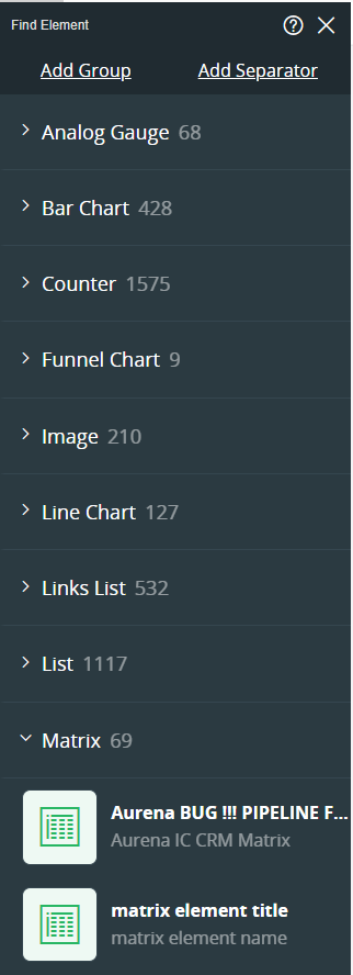
Element Browser
The Element Browser shows all elements in the repository. Each element type has it's own section, the section consist of the element type name and the number of elements in that section. To select an element click on the element in the Element Browser. The selected element will now be opened in the Element Designer. A section can be expanded and collapsed by clicking the arrow to the left of the section name..
The Element Browser has an option to search for all types of elements. To search for an element, type the search criteria in the search textbox. The search result will be shown instantly. The search functionality has the following search criteria:
- Search for the element's name
- Search for a author e.g. "author: <author name>"
- Search for a Data Source e.g. "ds: <data source name>"
- Search for a element type e.g. "tp: Chart"
Used In Pages
If the selected element is used in a Page a button "Used In" will show a number indicating in how many pages the current element is in. Clicking "Used In" button will open up a dialog where it’s possible to navigate to the Lobby Pages.
Protect Element
A button is available to Protect/Unprotect configuration. When the Configuration is protected by the author, the configuration properties are disabled to discourage modification.

Figure: Protect/Protected Button
There will be a button shown in the top area of the Element Designer in this case, and it's possible to enable the configurations back using the Edit Anyway button .

Figure: Protected:Edit Anyway button