Configuring List Elements
"List elements" can be used to visualize data in selected columns of a data source in tabular format. Following configuration sections are specific for "List Elements".
List Element Configuration Dashboard Preview
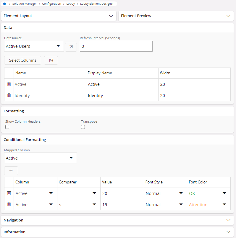
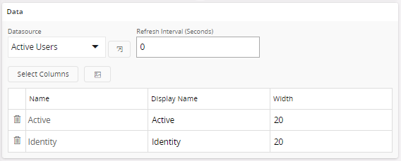
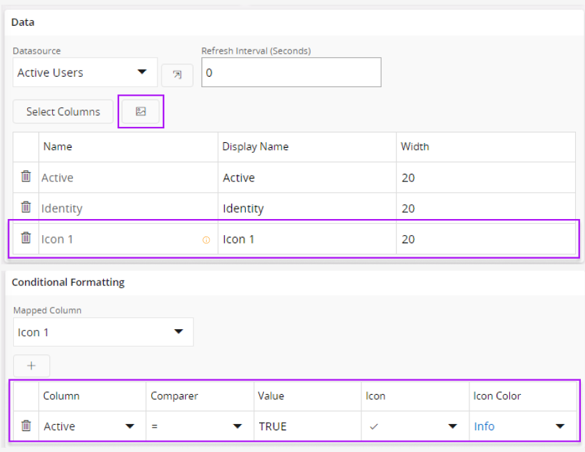
Data
Connect and configure a data source created by using "DataSource Designer"
Configuration Properties
Note: You can navigate to the selected data source by clicking the navigation button ( )
)
| Property | Description |
|---|---|
| Datasource | Select an available data source from the "Datasource" drop down menu |
| Select Columns | Select all the appropriate columns for the "List Element" from "Column Chooser" slide-out menu (More info.) |
| Add Icon | Add an icon that will be visible in the element (More Info.) |
| Refresh Interval (Seconds) | Define data refresh intervals in "seconds". |
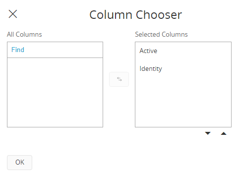
Select Columns
When you click on "Select Columns" button (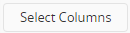 ) "Column Chooser" slide out menu will appear. click on any column name from the "All Columns" section and click the "transfer" button (
 )to move the desired column to "Selected Columns" section.
Add Icon
You can add a separate icon column to the list element by clicking "Add Icon" button ( ). Once you add an "Icon Column", you must add conditions for the icon types in conditional formatting section for icons to appear on "Icon Column".
Note: Please be aware that when you add an "Icon Column," an "alert sign" ( ) will be displayed next to the added icon. This serves as a reminder for you to add conditional formatting for the icon column. "Alert sign" will disappear when you add at least a single condition for the icon.
Steps:
- Go to "Conditional Formatting" section and select "Icon" you wish to add conditions from the "Mapped Column" dropdown menu.
- Click the "+" button (
 ) to add a new condition.
 - Add condition as explained in the "Conditional Formatting" section.
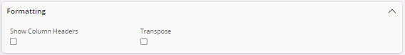
Formatting
You can configure the style of "List Element" from the "Formatting" section.
Configuration Properties
| Property | Description |
|---|---|
| Show Column Headers | Show/hide the column headers in the list element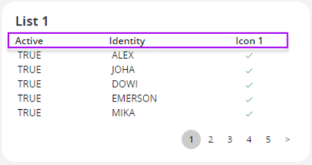 |
| Transpose | Switch the positions of rows and columns in the list element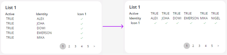 |
Conditional Formatting
Use the conditional formatting section to alter the appearance of "List Element rows" to a distinct format when it aligns with specific predefined condition.
Note: Add a condition by clicking the "+" Icon ( ) in the "Conditional Formatting" section.
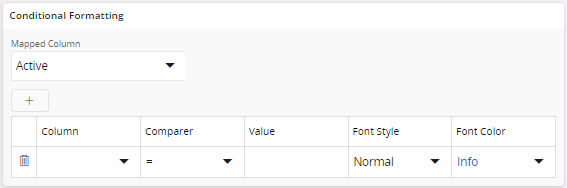
Configuration Properties
| Property | Description |
|---|---|
| Column | Select the desired column to add the condition |
| Comparer | Select any type of comparer from the "Comparer" dropdown menu. ( = , < , > , <= , >= ) |
| Value | Add any Conditional value (By applying one or more of these conditions to the specified "Column," the "Raw Value" will be presented with the configured formatting when it corresponds to the specified conditional value.) |
| Font Style | Select a font style from the dropdown menu for the 'counter value', when the specified condition is met. (Normal , Bold, Italic) (Not available for Icon columns) |
| Font Color | Select a font color from the dropdown menu to apply to the "counter value", when the desired condition is met. (Red, Orange, Green, Blue) (Not available for Icon columns) |
| Icon | Select an icon from the dropdown menu to display a unique icon within the "counter element", when the desired condition is met. (Only available If you add an Icon in the "Data" section) |
| Icon Color | Select the desired icon color. (Red, Orange, Green, Blue) (Only available If you add an Icon in the "Data" section) |