Colors used within IFS Aurena
Colors are used within the IFS Aurena Framework to better visualize the information in the client. They are mostly used with the emphasis property of the applicable control. Each color is defined as a constant and can be used across a range of components, in some cases the colors are limited to a single control, for example the color picker colors.
To see the most up to date color set, refer to the Icon Library in IFS Aurena located at: https://<server>:<port>/main/ifsapplications/web/iconlibrary
Color Picker Colors
Used in client control Color Picker for the defaultempshasis property.
| Name | Color |
|---|---|
Colorpicker0 |
Transparent |
Colorpicker1 |
Pink |
Colorpicker2 |
Blue |
Colorpicker3 |
Green |
Colorpicker4 |
Red |
Colorpicker5 |
Dark Blue |
Colorpicker6 |
Orange |
Colorpicker7 |
Yellow |
Colorpicker8 |
Dark Orange |
Colorpicker9 |
Dark Green |
Colorpicker10 |
Light Purple |
Colorpicker11 |
Purple |
Colorpicker12 |
Light Green |
Colorpicker13 |
White |
Colorpicker14 |
Light Gray |
Colorpicker15 |
Light Black |
Colorpicker16 |
Light Blue |
Colorpicker17 |
Dark Gray |
Colorpicker18 |
Light Pink |
Complementary Colors
The complementary colors serve the purpose of making it easier to distinguish between two different objects, without assuming a specific meaning of the color as such. For example, complementary colors can be used in a chart to make it easy to see which line is which. You can set the complementary colors of a client control by using its client control property emphasis.
Some important notes to keep in mind when using complementary colors:
- These colors could be completely different in different visual themes.
- These colors could be completely different in different releases.
- Do not assume that one of those colors will stay the same.
- Do not assume or assign a meaning to any of those colors.
Following are a list of available complementary colors in IFS Aurena:
| Name | Color | Comment |
|---|---|---|
Complementary1 |
Color1 | |
Complementary2 |
Color2 | |
Complementary3 |
Color3 | |
Complementary4 |
Color4 | |
Complementary5 |
Color5 | |
Complementary6 |
Color6 | |
Complementary7 |
Color7 | |
Complementary8 |
Color8 | |
Complementary9 |
Color9 |
Contextual Colors
In contrast to complementary colors, contextual colors are used to;
- Communicate a strong, specific meaning; for example, a red status for something that requires attention
- Include varying degrees of “neutral” system states in the framework
You can set the contextual colors of a client control by using its client control property emphasis.
Following are a list of available complementary colors in IFS Aurena:
| Name | Color | Comment |
|---|---|---|
OK, True, Success |
Green | |
Warning |
Yellow | |
Alert, Danger, Error, Failure, False |
Red | |
Info, Primary |
Blue/Purple/Orange | The color will depend on the selected theme. |
Default, Neutral, Normal |
Black/White/Gray | The color will depend on the selected theme. |
Data Validity Colors
Used in client control property emphasis to show the validity of the data. Typical controls that use these set of colors are the badge and state indicator.
| Name | Color |
|---|---|
ValidityActive |
Light gray-blue |
ValidityBlock |
Pink |
ValidityHidden |
Yellow |
Process Viewer Colors
Used within the process viewer control. The colors are determined by the selected IFS Aurena theme.
State Colors
State colors take two forms:
- Standard
- Progress
Standard State Colors
Used primarily with the state indicator, though they can also be used on other components such as badges. A “standard state” color has been assigned to the 30 most common states in IFS Cloud, based on the following intended meanings:
- Blue = Initiated
- Yellow = In Progress
- Green = Approved
- Pink = Outside of Normal Process
- Gray = Canceled
- Red = Error
While the afore mentioned color scheme is the norm, it is perfectly acceptable to use another emphasis color if the default does not make sense for your page, process, or flow. Colors are set by using the client control property emphasis.
Listed below are the 30 standard states and the associated colors in IFS Aurena framework:
| Name | Color | Comment |
|---|---|---|
StateCreatedStateNewStateStarted |
Dark Blue | |
StatePlanned |
Light Blue | |
StateInProgressStateChangedStateReceivedStatePrintedStateReservedStateAcknowledged |
Yellow | |
StateReleasedStateCompletedStateConfirmed |
Green | |
StateBlockedStateStoppedStateRejected |
Pink | |
StateClosed |
Dark Gray | |
StateObsoleteStateCanceled |
Light Gray | |
StateError |
Red | |
State Progress Colors
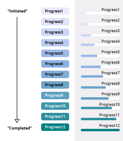
Progress colors were introduced to improve the range of state indicator colors, particularly for processes with many, progressive steps where the original State color set communicated too strong of a signal. The colors are based on a light-to-dark cool color palette, where light purple corresponds to “initiated” and dark green corresponds to “completed”. The color set is intentionally toned down compared to the complementary and contextual color sets, to draw less attention.
This color palette is particularly useful for:
- Processes with many statuses/steps, where a strong signal color is not necessary (or desirable)
- Client controls in lists such as badges, where a strong color indicator is not necessary (or desirable)
- To represent an item not requiring immediate attention
- To represent a relatively “neutral” state or category
Some important limitations to bare in mind when working with this color pallet:
- All 12 colors are not easily differentiated from each other nor are they recognizable in isolation, therefore, use with caution if this is important. You could consider using colors from this set if you choose progresses far apart from each other on the number scale, for example,
Progress1,Progress4,Progress7,Progress10,Progress12. Alternatively, you could use a few of these colors to supplement other color sets. - The state progress colors are not recommended for use with charts or calendars, since the colors are not easily distinguishable from one another (nor with blue and green emphasis colors in other color sets).
Below is a picture of how the color pallet is set along the progress: