Introduction - Aurena Page Designer
Aurena Page Designer is a tool to modify the standard layout and behavior of application pages in IFS Aurena and IFS Aurena Native. Applied changes to pages are stored as configurations and are application wide.
Open Page Designer
The Page Designer is opened from the user menu. Open Page Designer option will replace the navigator with the Page Designer pane. Note that the Open Page Designer menu option is only available from a configurable page (i.e. not the start page).
The pages for IFS Aurena Native Apps can be accessed via Solution Manager > Touch Apps > Configuration > Apps for Page Designer. Note that the Aurena Native Apps listed here are to be used within the Aurena Page Designer to make layout changes to the App only. They are not intended to be used for any other purpose.
Work in the Page Designer
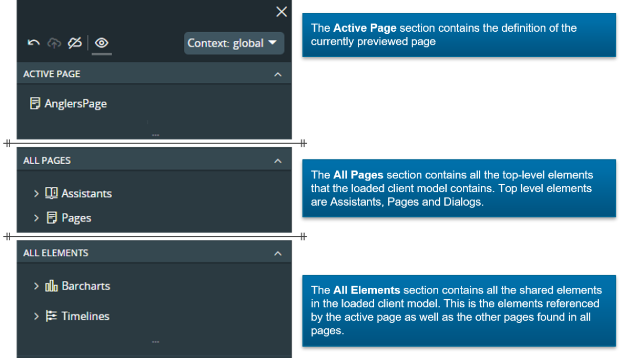
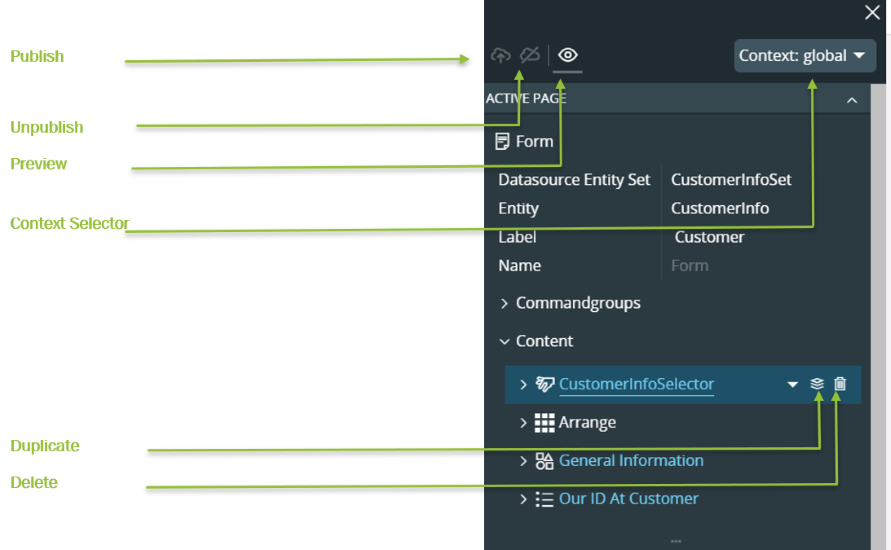
The Designer is built up by a toolbar and several collapsible panes. The toolbar consists of toolbar buttons for actions as well as the Configuration Context selector. See section about Configuration Context for information about how to work with contexts. The three default panes are the Active Page, All Pages and All Elements.
Enable / Disable Preview
When opening the page designer for a page the page will display changes done in the designer as a preview. This preview mode can be toggled between displaying the designer current state or current runtime.
 |
Preview is enabled and shows the current designer configured layout |
 |
Preview is disabled and the page now displays the runtime layout. |
Active Page
This is a representation of the content of the Current Page in the client model. It displays the metadata that builds up the current page.
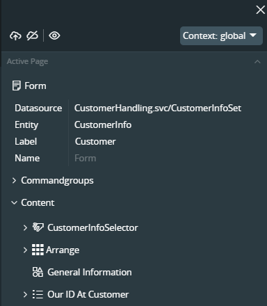
Change Active Page
When opening the page designer the metadata for the client model that the current page is part of is loaded to the client, the current page by default set as active page; i.e.; the page that is displayed in the preview. It is possible to switch the active page to any of the other pages in the same client model. This is done by selecting wanted page from the page dropdown in the header of the active page.
Element References
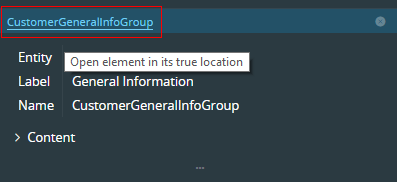
The building blocks of the metadata is elements. The designer displays all the elements for the client model in the two sections All Pages and All Elements. Some of the elements act as containers for other elements. For example a page have a content array that is a list of child elements for the page. Some of the elements are declared as inline, which means that they are defined within and belongs to the page element as a child node. Most of the elements is defined as common elements in the All Elements section and then referenced from other elements. Look at the Active Page picture below. The elements in the page content section that are linked elements is colored with link blue color and will display a link underline when hovered. The Arrange element is an inline element and are therefor colored in same color as the page attributes.
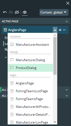
The referenced elements are linked and one can follow the link to se the actual element implementation. We have already stated that the elements is to be found in the All Elements section. This is also true. But it is a little bit impractical if the designer should scroll away down in a deep element structure when all you want is to get the actual element implementation. So whenever a referenced element link is clicked a preview pane is opened right below the pane in which you clicked the link. The element can be edited directly in the preview pane. The pane can then be closed if that is desired. If a preview pane is already opened when a link is clicked, the preview pane is reused and switch to displaying the latest element.
Note: The header of a preview pane is also blue colored and will show a link on hover. This is if one would like to locate the referenced element in its actual location within the All Elements section.
Translatable Attributes
When a Label is configured through the Aurena Page Designer translations needs to be added for relevant languages. For more information refer Translations in Configurations.
Change Indicators
When working in the designer it is easy to spot configuration changes and the status of them. A designer tree node or attribute will display a change indicator at the side of the object as a colored line. The line will be displayed in different colors and as solid or dotted. Each color or line emphasis has a meaning which not only show the user where there is changes made, but also in what staging state it currently is.
Indicators is shown both on parents and the actual item. This way it is easy to see if there exists configurations to handle even if the design tree is collapsed. A parent identifier is cumulative and will display the most significant state when child items exists in different states. If any child item is unsaved all parents will show unsaved indicators. If all child item changes are saved and there is a mix of published and unpublished configurations, the parents will indicate that there exists unpublished configurations. This logic follows and support the typical work flow: change -> save -> publish.
 |
Item or child item is changed and is not yet saved. For a parent item this means that there exists at least one unsaved change among the children. |
 |
Item or child item is configured but the configuration is not published. For a parent item this means that there is at least one saved configuration change that is not published. |
 |
Item or child item is configured and is fully published. For a parent item this means that all configurations done to child items are fully saved and published. |
Inspect changes
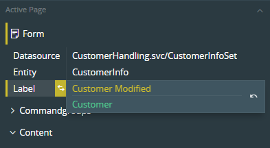
It is possible to inspect the details of an attribute value change. Hover the mouse over an attribute with a change indicator and a second indicator is shown. If this icon is hovered a change diff comparison is dropped down. Here both the previous and current value is shown. Even in this dropdown colors have a meaning. The value on top is the current value and it will be shown with unsaved or saved configuration color. The previous value at the bottom will show as white if no previous configurations was saved. If the change was made to a previously saved configuration the color will show as saved configuration.
In the picture below the label has previously been changed and saved as "Customer". Now it is changed to Customer Modified.
Page Designer Actions
Save
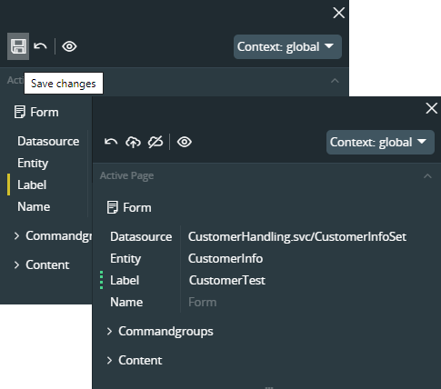
When making changes in the page designer all changed attributes will be marked with unsaved change indicator and the save button in the toolbar will be enabled. When changes are saved they are saved to a draft layer in the configuration storage.
Note: Saved configurations mean that they can be opened in the designer to be further worked on but without being published they will not turn up in the live application visible for end-users.
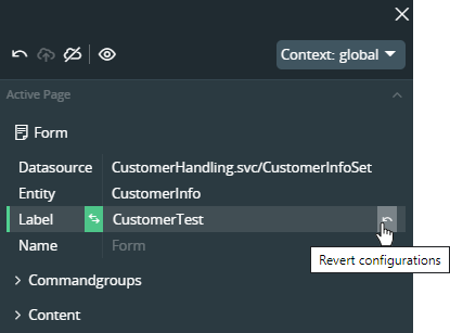
Undo / Revert configurations
On a changed attribute, parent items and in the toolbar an Undo / Remove command button will be visible whenever there are changes in any state. We name this action Undo or Revert depending on if the change is saved or not. The Undo / Revert command can be executed on several levels. If the command is executed on a parent that have modified child items. Then the selected action will be performed for the item and all descendants. Selected action means the consolidated action, in the same way as the change indicators show the most significant indicator. The Undo / Revert command will execute the most significant action.
- If a parent have only descendants with configurations that are saved and published. Then revert will revert all descendant values back to original value.
- If a parent have have descendants with a mix between configurations and unsaved changes. Then Undo will be executed on all the descendants with unsaved changes while the saved configurations will not be touched.
Undo
For an attribute that have unsaved changes one can undo the changes by pressing undo button on the attribute. This will directly undo the changes back to previous value. If it was the last unsaved change in the designer that was undone, then the save button will also be cleared.
Revert
When an attribute has a saved change, a configuration, one can revert the value back to original value. When reverting the value of the attribute will be set to the original value as a change. This means that it will turn up as a change and the save button will be shown. So a revert process is: Revert -> Save.
Note: Revert will consider published content. Reverting a configuration that is not based on a prior published configuration the value will be reverted to the original value. Reverting a configuration that is done on top of a published configuration then the value will be reverted to the published value, not the original.
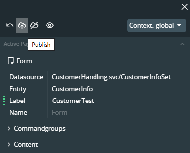
Publish
By publishing configurations they are staged to be visible for end-users running the application. Publish is performed from the main toolbar and can only be performed as a global action. It is not possible to cherry-pick configurations to be published. It is an all or nothing operation. It is not possible to publish while there are unsaved changes somewhere in the designer. This is also visualized in the toolbar. The publish and unpublished command buttons are not visible when the save button is visible.
If there are previously published content when publish is performed. The published content will be synchronized with the current state. After publish has been performed all dotted change indicators should have switched to a solid line.
Unpublish
Remove all published configuration which means hiding it for end-users running the application. Unpublish is like publish an all or nothing operation that is executed from the toolbar.
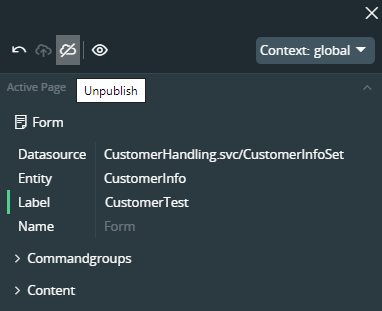
Note: Unpublish is a potentially destructive operation. Compared to publish, after you have published you saved draft configuration and the published configuration will be equal. So when you publish you can toggle back and forward between publish / unpublish. Everything will stay the same what differs is if it is visible to end-users or not. If you have worked on your configurations since you published last. Then your draft configurations is no longer equal. If we at this point choose to unpublish, then there is no way to regret the action and get back to the same publish state. We can of course publish what we have in draft, but that is no longer the same as the content that was just unpublished.
Duplicate
Makes a duplicate of the original element including all child elements. This action is typically used for the purpose of creating a template for a new element. Instead of creating an element from top to bottom, it can be easier to duplicate an existing element and adjust.
Note: Several elements contains references to other elements; e.g.; The page element content array typically holds references to other elements like groups, lists. When duplicating an element, the element is duplicated together with the reference. But the referenced element itself is not duplicated. After the duplication there is now two parent elements both referencing the same child element. Making any change to the child element will affect both parents in the same way. Duplicate action will duplicate as is, without any transformations. Some attributes of an element may in turn contain references to the original element name. So a duplicated element can’t be expected to work out of the box. For most scenarios that involve duplicate, the intention is to provide a secondary version of an original page. For these cases configuration context is the preferred and recommended tool. A context will let you change every aspect of the element without creating logical errors, due to name changes.
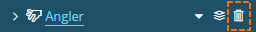
Delete
Attributes and elements that is not mandatory can be deleted / removed from the configuration. Attributes and nodes that can be removed will show a delete command icon when hovered.
Note: There is sometimes a choice between removing an item or hiding it; e.g.; Fields in a group, Tabs in a Tab. It is typically easier and gives size benefits just to delete the items not needed. It is important to make sure that these items is not used by conditions or in another way by an item that still resides in the layout though.
Once an attribute/ element is deleted, it will be visible in the page designer with a strikethrough as follows.
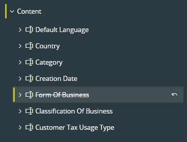
This will make the tracking of deleted items easier and also like any other page designer configuration, deletions can be reverted at the node level.
Note: When an existing configured artifact is impacted with a core delivery, e.g.: A new field added to the same artifact in the CORE layer such items will also be visible in the page designer as a deleted item - meaning an element not available in the current configuration. If this new element is needed to be incorporated in to the existing configuration, the deletion on the specific attribute has to be reverted and synchronized with the existing configuration.
Available Configuration Functionality in the Page Designer
Examples of functionalities available in the Page Designer:
- Edit Page Labels, Field Labels and section Labels
- Hide Fields
- Set fields to mandatory
- Change placements of fields
- Rearrange elements on pages
- Configure steps in assistants
- Add Custom Attributes to a page
- Add new elements to a page
Note: In general when it comes to dialogs and assistants, there are limited configuration possibilities compared to regular pages.