Charts
To add a chart to your layout, use the chart tool  . Click inside a cell or a block container to place a chart and you will be presented with a chart type selection dialog.
There are three types of charts defined in IFS Report Designer:
- Pie chart
- Bar chart
- Line chart
When you have selected the desired type, a dialog will open where you can configure your chart. The configuration can be accessed later by selecting Edit on the popup-menu. To resize the chart you just have to resize the cell or container containing the chart.
Pie Chart
A sample pie chart is used to show how different options and settings affect the chart. Note that this sample chart shown in the chart dialog as well as in design mode in the layout is only an example. The data used in this sample is not in any way connected to the real data of the report. The final result may vary depending on the data (number of series, exact values and so on). Do a preview of the report with some real data to get a better view of how the diagram will look once you use the report in runtime.
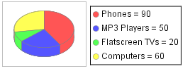
Pie chart example
The Pie Chart dialog contains following tabs:
- Data Fields
- Titles
- Options
- Colors
Data Fields
In order to create a pie chart you need two sets of data: one containing the numbers (value series) and a second one containing the descriptions (label series). For both parts you select a node in the XML schema containing the desired data. The numbers provided by the first node will affect the number and sizes of the circle sectors. The texts in the second sets will be used in the chart legend. Those two series is the minimum amount of information you have to specify to create a pie chart.
Titles
If you want to have a chart title, select a node containing the title string. It can be a node in the data flow, a node in the translation tree, a report text or any XML node that contains a single string. Instead of selecting a node you can edit the field and write an XPath expression to be evaluated. For example you could write a hard coded string (no need to enclose it in single quotes). Note that hard coding titles is not recommended as it prevents their translation.
There you have the options to change the font family, font size and the font color of the chart title. By default chart title is set to bold and you also have the option to change it.
Options
Here you can choose the chart legend positioning, the label style and whether the chart should have a 3D appearance or not.
Also legend font family and the font size can be changed. Changing the legend font size is important when you want the legend to appear in a single line.
Effects of changing the options settings are instantly visible in the preview chart.
Colors
Here you can select what colors should be used in the chart. If you know that your report will be used on a black and white printer, you can use black and white patterns instead, by checking the Black and white checkbox.
Bar chart
There are two variants of a bar chart. The first one shows the same data as a pie chart - a sequence of values with associated labels, only that the values are shown as vertical bars instead of circle sectors.
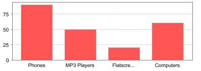
A simple bar chart
The second type shows multiple series in the same chart. For example, the above chart shows sales of products: the X-axis shows product names while the Y-axis shows sales. You can add another dimension to this chart, for example by showing sales of products by year, as shown in the following figure:
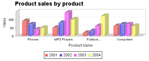
A multiple bar chart
The bar chart dialog contains the following tabs:
Data fields
This is the most important part, where you connect your chart to report data. The data must arranged in a way that clearly shows how the different parts relate to each other. For example, in order to create a chart like in the previous figure, you can arrange the data in two ways - either you have elements corresponding to years where each "year" contain a number of product/value pairs, or you have a number of "product"-nodes where each "product" contains a number of year/value pairs.
X-axis series: connect this to the node containing whatever should go on the X-axis. In the examples above that is product name.
Y-axis series: the nodes containing the values (bar height). In the examples above that is product value.
Group by: if you leave this field empty, the chart will be a simple bar chart. Otherwise specify which node corresponds to the colors in the chart. In the example above that is year.
Titles
Chart title: the XML element containing the string to be put on top of the chart (if any).
X-axis label: the XML element containing the label to be placed under the X-axis (if any).
Y-axis label: the XML element containing the label to be placed beside the Y-axis (if any).
Instead of selecting a node you can edit the fields. See the notes under Pie Chart Titles. There you have the options to change the font family, font size and the font color of the chart title and axis labels. By default chart title is set to bold and axis labels are not bold, there you also have the option to change it.
Options
See Pie Chart options.
Legend position: decides the position of the chart legend, just like for the other charts (top, bottom, right or left).
Legend Font family and size: see Pie Chart options.
Additionally you have a option called Rotate X-axis values, which enables you to rotate the x-axis value labels from 45, 60 or 90 degrees. This option is useful when you have lengthy x-axis value labels to be displayed, it eliminates the limitation of being hidden the part of the lengthy labels.
Colors
See Pie Chart colors
Line Chart
A line chart represents a sequence (or multiple sequences) of paired data in form of a line.
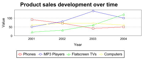
Line chart example
The line chart dialog contains following tabs:
Data fields
This part works exactly like bar chart data fields.
Titles
This part works exactly like bar chart titles.
Options
Legend position: decides the position of the chart legend, just like for the other charts (top, bottom, right or left).
Legend Font family and size: see Pie Chart options.
Rotate X-axis values: see Bar Chart Options.
Show shapes: when selected, it puts a small distinct shape on every data point on the line. Those shapes have two functions: they indicate which points of the line are actual data and which are interpolated, and they help to identify the line by other means than color, which can be useful when printing in black and white.
Start Y-axis at zero: when selected, Y-axis scale starts from zero, otherwise Y-axis scale range limits from Minimum to Maximum values. This option is useful when there is a big gap between the zero and the minimum of the Y-axis data values, which enables all data points to be displayed in the smallest plot.
Start chart from Y-axis: when selected, first category of the X-axis starts from the Y-axis, otherwise there will be a gap between the first category of the X-axis and the Y-axis.
Effects of changing the options settings are instantly visible in the preview chart.