Gantt Chart
A Gantt chart provides a graphical illustration of a schedule that helps to plan, coordinate and track specific tasks.
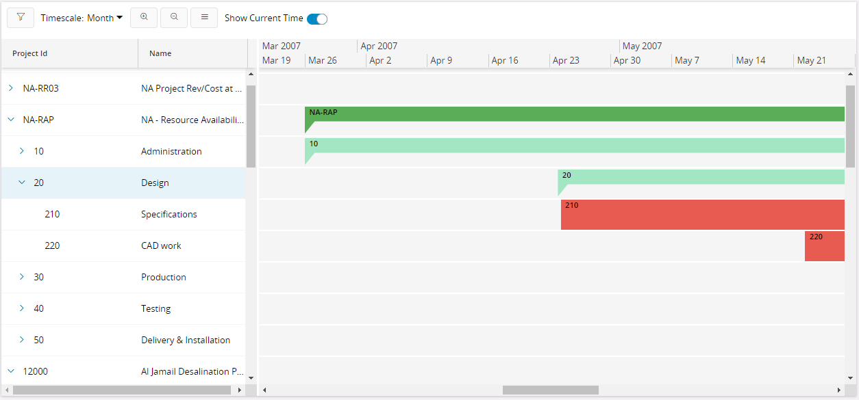
Figure 1 - Gantt Chart Control
When to use
Use the Gantt chart control when you want to display information that needs to be planned, coordinated and progress tracked.
Limitations
How to use
Follow the steps below to add a Gantt chart to a page:
1. Define a gantt chart
Define a gantt chart in the client model file using the following format:
ganttchart <gantt_chart_name> for <entity_name> {
   ...
}
<gantt_chart_name> - Identity of the gantt chart, always use a meaningful identifier.
<entity_name> - The entity the gantt chart is based on, see example below:
-------- Example code ----------
ganttchart ProjectGantt for Project {
   ...
}
2. Add the gantt chart to the container
Add the Gantt chart to a page. A Gantt chart gets its values from a data source which is either an entityset, or an array. This populates the tree like structure for the Gantt chart. Items for each row are fetched using dependent arrays:
page <page_name> {
    ganttchart <gantt_chart_name> using <entityset_for_gantt_chart>;
}
`<entityset_for_gantt_chart>` - This is the [entityset](../../110_projection_controls/entityset/) that serves as the data source from which the Gantt chart gets its values to populate the tree like structure. The [entityset](../../110_projection_controls/entityset/) must be based on the same [entity](../../110_projection_controls/entity/) that was used to define the Gantt chart.
-------- Example code Method 1 ----------
ganttchart ProjectGantt using ProjectRows {
...
}
page <page_name> using <entityset_for_page> {
    ganttchart <gantt_chart_name>;
}
This method is useful if the purpose of the [page](../../100_pages_and_structure/100_page_types/030_page/) is to display the Gantt chart. In such instances it is not mandatory to define an [entityset](../../110_projection_controls/entityset/) for the Gantt chart since it gets its values from the `<entityset_for_page>`.
------ Example code Method 2 ------
page GanttPage using Projects {
ganttchart ProjectGantt;
}
3. Set the appropriate properties for the Gantt chart
Set one or more properties for the Gantt chart such as label, datagrid, and ganttchartitem. For a complete list of the properties and how to set them see the Properties section below.
4. Add datagrid to the Gantt chart
The datagrid is the tree like structure on the left of the chart. It can be a flat structure or a hierarchical structure depending on how the Gantt chart is defined.
Each row in the grid is termed as a Gantt Row. Each Gantt row has corresponding Gantt items.
Figure 2 - Gantt Chart Control - Data Grid
-- Example code - Adding datagrid to Gantt chart --
ganttchart ProjectGantt for Project {
label = "Project Gantt";
    datagrid {
        ganttcolumn ProjectId {
            label = "Project Id";
    }
        ganttcolumn Name {
            label = "Name";
        }
    }
}
5. Add the Gantt items to display in the Gantt chart
Gantt items are the elements in the Gantt chart that are scheduled, planned and tracked.
Figure 3 - Gantt Chart - Gantt Items
- Defining the Gantt Item
ganttchartitem <gantt_chart_item_name> for <entity_name> {
    starttime <start_time_attribute>;
    endtime <end_time_attribute>;
}
 `<gantt_chart_item_name>` - Identity of the gantt chart item, always use a meaningful identifier.
 `<entity_name>` - The [entity](../../110_projection_controls/entity/) the gantt chart item is based on.
 `<start_time_attribute>` - Attribute on the [entity](../../110_projection_controls/entity/) that is used to fetch the start time of the item.
 `<end_time_attribute>` - Attribute on the [entity](../../110_projection_controls/entity/) that is used to fetch the end time of the item.
---- Example code - Defining a Gantt Chart Item ----
ganttchartitem ProjectItem for Project {
starttime PlanStart;
endtime PlanFinish;
}
- Add the Gantt item to the chart
ganttchartitem <gantt_chart_item_name>(<gantt_item_array>);
 `<gantt_chart_item_name>` - Identity of the gantt chart item.
 `<gantt_item_array>` - This is the [array](../../../../../../060_development/022_user_interface/030_aurena_dev/140_resources/aurena_keywords/index.md#array) used to populate the gantt items with respect to the gantt row.
------ Example code - Defining a Gantt Chart Item ------
ganttchart ProjectGantt for Project {
    label = "Project Gantt";
    datagrid {
        ganttcolumn ProjectId {
            label = "Project Id";
        }
        ganttcolumn Name {
            label = "Name";
        }
    }
    ganttchartitem ProjectItem(ProjectItemArray);
}
6. Creating a hierarchical structure
As mentioned above the Gantt tree structure can be hierarchical. This is achieved by adding gantt chart rows recursively. Each row must also have corresponding items.
- Define a Gantt Row
ganttchartrow <gantt_chart_row_name> for <entity_name> {
    datagrid {
        ganttcolumn <attribute_name>;
        ganttcolumn <attribute_name>;
        ...
    }
    ganttchartitem <gantt_chart_item_name>(<gantt_item_array>);
    ganttchartrow <gantt_chart_row_name>(<gantt_row_array>);
    ...
}
 `<gantt_chart_row_name>` - Identity of the Gantt chart row, always use a meaningful identifier.
 `<entity_name>` - The [entity](../../110_projection_controls/entity/) the gantt chart row is based on.
 `<attribute_name>` - Attribute on the [entity](../../110_projection_controls/entity/) corresponding to the columns defined in ganttchart definition.
 `<gantt_chart_item_name>` - Identity of the gantt chart item corresponding to this row.
 `<gantt_item_array>` - This is the array used to populate the gantt items corresponding to this row.
 `<gantt_chart_row_name>` - Identity of the gantt chart sub-level row.
 `<gantt_row_array>` - This is the array used to populate the sub-level rows.
------ Example code - Defining a Gantt Chart Item ------
ganttchartrow SubProjectRow for SubProject {
    datagrid {
        ganttcolumn SubProjectId;
        ganttcolumn Description;
    }
    ganttchartitem SubProjectItem(ChildSubProjectItemArray);
    ganttchartrow SubProjectRow(ChildSubProjectArray);
    ganttchartrow ActivityRow(ActivityArray);
}
- Adding the Gantt Chart Row
--- Example code - Adding to Gantt Chart Root level ---
ganttchart ProjectGantt for SubProject {
    datagrid {
        ganttcolumn SubProjectId;
        ganttcolumn Description;
    }
    ganttchartitem ProjectItem(ProjectItemArray);
    ganttchartrow SubProjectRow(SubProjectArray);
}
------ Example code - Adding to a sub-level ------
ganttchartrow SubProjectRow for SubProject {
    datagrid {
        ganttcolumn SubProjectId;
        ganttcolumn Description;
    }
    ganttchartitem SubProjectItem(ChildSubProjectItemArray);
    ganttchartrow SubProjectRow(ChildSubProjectArray);
    ganttchartrow ActivityRow(ActivityArray);
}
There can be different types of sub-level rows and they can also be recursive as shown in the above example code.
7. Adding Schedule information
It is possible to display schedule information (working and non-working time periods). Each row can have a separate schedule. Non working times are grayed out.
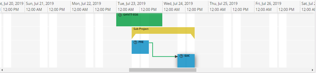
Figure 4 - Gantt Chart - Gantt Schedules
- Define a schedule
     ganttchartschedule <gantt_chart_schedule_name> for <entity_name> {
         scheduleid <schedule_id>;
         schedulestart <schedule_start_time>;
         scheduleend <schedule_end_time>;
        ganttchartitemstyle <schedule_style> = [<style_boolean_value>];
    }
 `<gantt_chart_schedule_name>` - Identity of the schedule, this needs to be a meaningful identifier.
 `<entity_name>` - The [entity](../../110_projection_controls/entity/) schedule is based on.
 `<schueduleid>` - An attribute in entity which uniquely identifies each schedule.
 `<schedule_start_time>` - Attribute for schedule start.
 `<schuedule_end_time>` - Attribute for schedule end.
 `<gantt_style_item_name>` - Identity of the Gantt chart style item, it is necessary to always use a meaningful identifier.
 `<style_boolean_value>` - Either [true] or a condition that evaluates to a boolean value.
    --- Example code - Defining a Gantt Chart Schedule ----
    ganttchartschedule WorkingShiftSchedule for WorkTimeCalendar {
        scheduleid CalendarId;
        schedulestart FromTime;
        scheduleend ToTime;
        ganttchartitemstyle OvertimeStyle = [true];
    }
- Add schedule to gantt chart or row
   scheduleid <schedule_id_for_row>;
   ganttchartschedule <gantt_chart_schedule_name>(<row_schedule_array>);
 `<schedule_id_for_row>` - Attribute in entity which defines schedule id for each row.
 `<gantt_chart_schedule_name>` - Identifier for gantt chart schedule.
 `<row_schedule_array>` - An array which provides data to populate schedule information.
   ---- Example code - Adding to Gantt Chart Root level ----
    ganttchart ProjectGantt for Project {
        scheduleid ProjectCalendarId;
        ganttchartschedule WorkingShiftSchedule(WorkingTimeArray);
    }
------ Example code - Adding to a sub-level ------
ganttchartrow SubProjectRow for SubProject {
    scheduleid ProjectCalendarId;
    ganttchartschedule WorkingShiftSchedule(SubProjectWorkingTimeArray);
}
8. Adding information and actions using cards
A card can be connected to the Gantt chart row and/or item to display additional information. A standard card is used so other properties such as actions can also be made available to the Gantt chart.
- Adding a card to Gantt Row
ganttchartrow SubProjectRow for SubProject {
    datagrid {
        ganttcolumn SubProjectId;
        ganttcolumn Description;
        card SubProjectCard;
    }
    ganttchartitem SubProjectItem(ChildSubProjectItemArray);
    ganttchartrow SubProjectRow(ChildSubProjectArray);
    ganttchartrow ActivityRow(ActivityArray);
}
- Adding a card to Gantt Item
ganttchartitem ActivityItem for Activity {
    starttime EarlyStart;
    endtime EarlyFinish;
    card ActivityCard;
}
9. Styling Gantt Items
Predefined shapes and emphasis can be used to depict Gantt items in visually different ways. This is useful for example when working with a hierarchical structure and each sub-level needs to be visually distinct from each other.
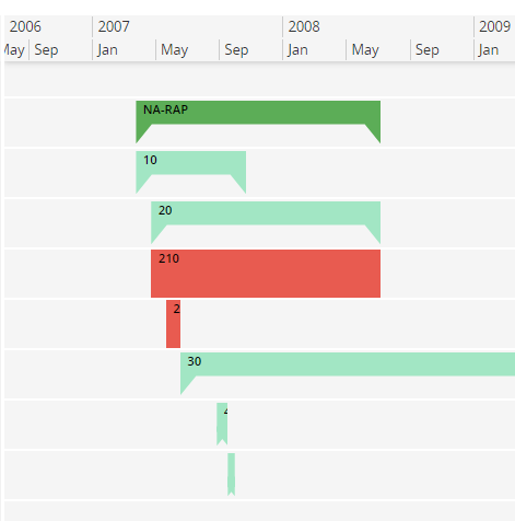
Figure 5 - Gantt Chart - Gantt Item Styles
- Defining a Gantt Item Style
ganttchartitemstyle <gantt_style_item_name> {
    shape = <predefined_shape>;
    emphasis = <emphasis_color>;
    icon = <icon_name>;
}
 `<gantt_style_item_name>` - Identity of the Gantt chart style item, always use a meaningful identifier.
 `<predefined_shape>` - One of `default/bracket/diamond/buffer/icon/baseline/highlight/crossbracket/thinbracket`. If shape is icon, then `icon` needs to be specified.
 `<emphasis_color>` - A value from the emphasis emphasis list.
 `<icon_name>` - Icon name from icon library to be used with icon shape type.
------ Example code - Defining Styles ------
ganttchartitemstyle ProjectGanttStyle {
    emphasis = Complementary9;
    shape = bracket;
}
ganttchartitemstyle ActivityGanttStyle {
    emphasis = Primary;
    shape = default;
}
ganttchartitemstyle MilestoneActivityGanttStyle {
    emphasis = Primary;
    shape = diamond;
}
ganttchartitemstyle TotalFloatGanttStyle {
    emphasis = State-Cancelled;
    shape = buffer;
}
ganttchartitemstyle ProjectConnectionGanttStyle {
    emphasis = Complementary7;
    shape = icon;
    icon = "document-cart";
}
- Adding a Style to a Gantt Item Multiple styles can be declared for a Gantt item, but only one will be true at a particular time.
ganttchartitem ProjectItem for Project {
    ...
    ganttchartitemstyle <gantt_style_item_name> = <style_boolean_value>;
    ganttchartitemstyle <gantt_style_item_name> = <style_boolean_value>;
}
 `<gantt_style_item_name>` - Identity of the gantt chart style item, always use a meaningful identifier.
 `<style_boolean_value>` - Either [true] or a condition that evaluates to a boolean value.
------ Example code - Adding Styles ------
ganttchartitem ProjectItem for Project {
    ...
    ganttchartitemstyle ProjectGanttStyle = [true];
}
ganttchartitem ActivityItem for Activity {
    ...
    ganttchartitemstyle ActivityGanttStyle = [TotalFloat != 0];
    ganttchartitemstyle CriticalActivityGanttStyle = [TotalFloat = 0];
    ganttchartitemstyle MilestoneActivityGanttStyle = [TotalWorkDays = 0];
}
10. Displaying Connections
Connections are drawn between items, there are several types of connection, each defines a different behavior for each connection. These connections are used to set rules for scheduling. . User can select one or more connections and perform actions. Tooltip will be displayed when hoovering for additional information.
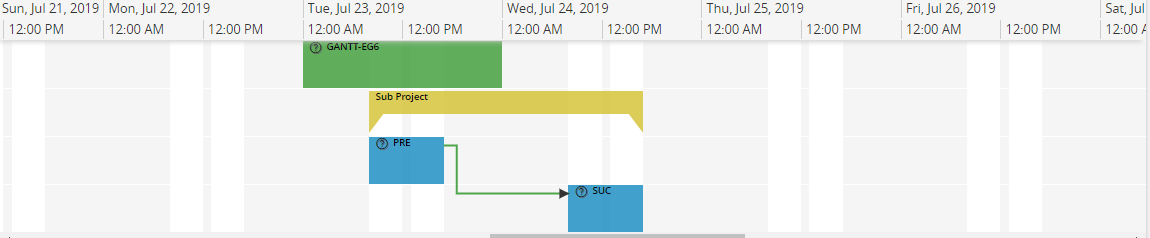
Figure 6 - Gantt Chart - Gantt Connections
- Defining Gantt Connection
   ganttdependency <gantt-chart-dependency> for <entity> {
       dependencytype StartToStart = [<gantt-chart-dependency-condition>];
       dependencytype StartToFinish = [<gantt-chart-dependency-condition>];
       dependencytype FinishToStart = [<gantt-chart-dependency-condition>];
       dependencytype FinishToFinish = [<gantt-chart-dependency-condition>];
       fromitem = "<predecessor-key>";
       toitem = "<successor-key>";

   tooltip {
field <attribute>
   }

   }
 `<gantt-chart-dependency>` - Identity of the gantt chart connection, always use a meaningful identifier.
 `<entity>` - The [entity](../../110_projection_controls/entity/) connection is based on.
 `<gantt-chart-dependency-condition>` - Either [true] or condition that evaluates to a boolean value.
 `<predecessor-key>` - An attribute from entity which defines the predecessor of the connections. This should be related to `itemid` given when creating gantt chart items.
 `<successor-key>` - An attribute from entity which defines the successor of the connections. This should be related to `itemid` given when creating gantt chart items
 `<attribute>` Field attribute that needs to be displayed on the tooltip
-- Example code - Defining a Gantt Chart Connection --

ganttdependency GanttActivityDependency for ActivityDependency {
    dependencytype StartToStart = [DependencyType = "StartToStart"];
    dependencytype StartToFinish = [DependencyType = "StartToFinish"];
    dependencytype FinishToStart = [DependencyType = "FinishToStart"];
    dependencytype FinishToFinish = [DependencyType = "FinishToFinish"];
    fromitem = "${PredecessorActivitySeq}";
    toitem = "${SuccessorActivitySeq}";
}
- Adding connections to row
ganttdependency <gantt-chart-dependency>(<dependency-array>);
 `<gantt-chart-dependency>` - Identity of the gantt chart connection.
 ``<dependency-array>` - This is the [array][5] used to populate the gantt connections with respect to the gantt row.
-- Example code - Adding a Gantt Chart Connections --
ganttchartrow ActivityRow for Activity {
    ganttdependency GanttActivityDependency(DependencyArray);
}
11. Enabling CRUD actions
CRUD actions on items is performed by invoking custom, CRUD specific, commands. These commands are responsible for performing the appropriate actions required to modify the data according to business logic. In other words: the framework does not assist in persisting the changes, it's all up to the provided commands to invoke actions and database procedures as needed.
The command declarations have much in common with the declaration of ordinary command's except they are declared inline in the item declaration and have dedicated names.
- Enabling crud actions on an item
ganttchartitem ActivityItem for Activity {
    ...
    <gantt-command-name> command {
        enabled = <enabled_condition>;
        execute <execute-block>
    }
}
`<gantt-command-name>` - Can be one of these 5: \* `create` - Command invoking actions required to insert a new item record. Will provide data for parent properties used in the row -> item relation (to insert at correct row). \* `move` - Command invoking actions required to move an item. Will provide data for the new start and end times as well as parent properties used in the row -> item relation (for changing row). \* `resize` - Command invoking actions to resize an item. This means changing the end time of the item. Will provide data for the new end time. \* `edit` - Command invoking actions to arbitrary edit properties of the item. \* `delete` - Command invoking actions to delete an item record.
All of these can also use parent.-syntax to access parent properties (the row record).
`<enabled-condition>` - Condition evaluated to a boolean expression. Can use parent.-syntax to access parent properties (the row record). See [command](../card/) and [enabled](../../../140_resources/client_control_properties#enabled).
`<execute-block>` - Code to be executed once the command is invoked. See [command](../card/) and [execute/bulkexecute](../../../140_resources/client_control_properties#execute_bulkexecute).
- Comments on individual commands For these examples, consider the following row -> item relation:
-- Example code - Entity relation for gantt row -> item --
@Override
entity ActivityRow {
    array ActivityRef(ProjectId, ActivityRowId) to Activity(ParentProject, ParentRow);
}
create command
Enabling the create command on an item enables the ability to draw a rectangle on a row in the gantt. This rectangle represents the time period which will be populated to the created record. The row that the rectangle is drawn upon is used to populate the properties, which determine the row of the item.
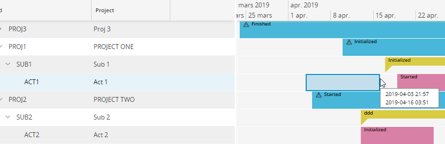 Figure 7 - Gantt Chart - Gantt Create interaction
Here we draw the rectangle on row ACT1. This will result in the properties
Figure 7 - Gantt Chart - Gantt Create interaction
Here we draw the rectangle on row ACT1. This will result in the properties ParentProject, ParentRow, ActivityStart, ActivityEnd to be populated on the resulting Activity record. The command is the executed and can then invoke an action to persist the record or open a dialog to modify more properties or do whatever is necessary.
move command
When the move command is enabled, the user is able to use simple drag and drop interaction to modify the start and end time of an item, as well as the row on which the item is located at. User can select multiple items and move within their respective rows. bulkexecute is supported for execute block of the move command.
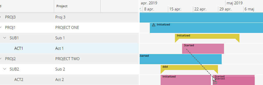 Figure 8 - Gantt Chart - Gantt Move interaction
By doing this, the attributes
Figure 8 - Gantt Chart - Gantt Move interaction
By doing this, the attributes ParentProject, ParentRow, ActivityStart, ActivityEnd are updated on the record before executing the command.
resize command
Enabling this command means the user can drag the trailing edge of the item to change the "size" or end time of the item.
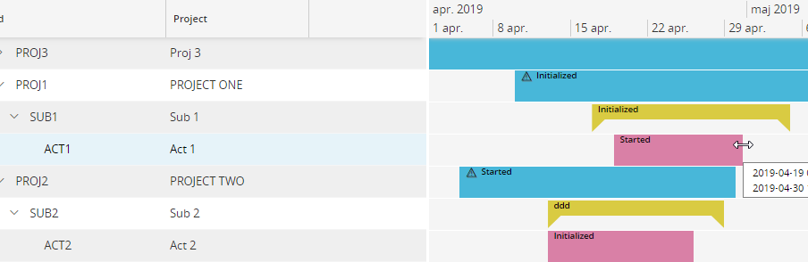 Figure 9 - Gantt Chart - Gantt Resize interaction
This will update the
Figure 9 - Gantt Chart - Gantt Resize interaction
This will update the ActivityEnd property of the record before executing the command.
edit command
Enabling this command has the prerequisite that the card also has a card defined. An edit button will show up on the card on an item with edit command enabled.
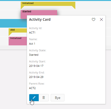 Figure 10 - Gantt Chart - Gantt Edit interaction
Edit command does not modify the record before executing the command.
Figure 10 - Gantt Chart - Gantt Edit interaction
Edit command does not modify the record before executing the command.
delete command
Enabling this command has the prerequisite that the card also has a card defined. An delete button will show up on the card on an item with delete command enabled.
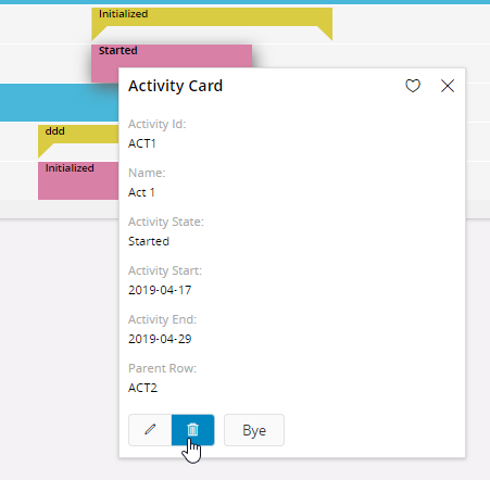 Figure 11 - Gantt Chart - Gantt Delete interaction
Delete command does not modify the record before executing the command.
3. Adding commands to an item:
Figure 11 - Gantt Chart - Gantt Delete interaction
Delete command does not modify the record before executing the command.
3. Adding commands to an item:
-- Example code - Gantt Item with all commands defined --
ganttchartitem ActivityItem for Activity {
    starttime ActivityStart;
    endtime ActivityEnd;�
    card ActivityPreview;
    create command {
        enabled = [ParentProject = "PROJ1"];
        execute {
            dialog CreateDialog(ActivityId, ActivityStart, ActivityEnd, ParentProject, ParentRow) into(ActivityId, ActivityStart, ActivityEnd, ParentProject, ParentRow) {
                when OK {
                    call CreateActivity(ActivityId, ActivityStart, ActivityEnd, ParentProject, ParentRow);
                    exit;
                }
                when CANCEL {
                    exit "CANCEL";
                }
            }
        }
    }
    move command {
        enabled = [ParentProject = "PROJ2"];
        execute {
            call MoveActivity(ActivityStart, ActivityEnd, ParentProject, ParentRow);
        }
    }
    rezise command {
        enabled = [ParentProject = "PROJ2"];
        execute {
            call ResizeActivity(ActivityEnd);
        }
    }
    edit command {
        enabled = [true];
        execute {
            call ModifyActivity(ActivityId, ActivityStart, ActivityEnd, ParentProject, ParentRow);
        }
    }
    delete command {
        enabled = [parent.State != "Finished"];
        execute {
            call DeleteActivity();
        }
    }
}
12. Custom Commands
Commands can be defined inside ganttchartitem. These commands appear in the Gantt chart command toolbar and gantt chart item cards. These commands unlike the multiselect command operate on a single type of ganttchartitem.
ganttchartitem <gantt_chart_item_name> for <entity_name> {
   command <command_name>;
   commandgroup <command_group_name>{
     command <command_name>;
     command <command_name>;
   }
}
13. Filtering values
- Using the filter No additional coding needs to be done. All fields declared in the datagrid will be added as filter fields. These will appear both in the page search panel and in the Gantt component filter panel. Using this filter mechanism only filters data at the root level since the filter fields are bound to that entity.
- Using searchcontext The page searchcontext and Gantt chart component level searchcontext can be used in combination to filter the root and sub-level data sets. Using the searchcontext gives the additional possibility to filter on some default values.
-- Example code - Page searchcontext --
page ProjectGantt using Projects {
    label = "Project Gantt Chart";
    searchcontext PageSearchContext {
        defaults = GetPageSearchContextDefaults();
    }
    ganttchart ProjectGantt using ProjectRows {
        filter = [PlanStart > PageSearchContext.FromDate and PlanFinish < PageSearchContext.ToDate];
    }
}
-- Example code - Gantt chart searchcontext at root level --
page ProjectGantt using Projects {
    label = "Project Gantt Chart";
    searchcontext PageSearchContext {
        defaults = GetPageSearchContextDefaults();
    }
    ganttchart ProjectGantt using ProjectRows {
        searchcontext GanttSearchContext {
            defaults = GetGanttSearchContextDefaults();
        }
        filter = [PlanStart > PageSearchContext.FromDate and PlanFinish < PageSearchContext.ToDate and EarnedValueMethod = GanttSearchContext.EarnedValueMethod];
    }
}
-- Example code - Gantt chart searchcontext at sub-level --
ganttchartrow SubProjectRow for SubProject {
    datagrid {
        ganttcolumn SubProjectId;
        ganttcolumn Description;
    }
    ganttchartitem SubProjectItem(ChildSubProjectItemArray);
    ganttchartrow SubProjectRow(ChildSubProjectArray);
    ganttchartrow ActivityRow(ActivityArray) {
        filter = [PlannedCostDriver = GanttSearchContext.PlannedCostDriver];
    }
}
14. Legend
Display different types of items and their meaning grouped in a logical manner.
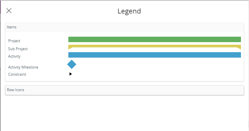
Figure 12 - Gantt Chart - Legend
- Define a legend
     ganttchartlegend <gantt_chart_legend_name> {
        legendgroup <legend_group_name> {
        label = "<group_label>";
        ganttchartitemstyle <item_style>;
    }
 `<gantt_chart_legend_name>` - Identity of the Gantt chart legend, always use a meaningful identifier.
 `<legend_group_name>` - Identity of the Gantt chart legend group, always use a meaningful identifier.
 `<group_label>` - Label to be displayed on each group header.
 `<item_style>` - Any item style.
    ------ Example code - Defining Legend ------
    ganttchartlegend ProjectLegend {
        legendgroup ItemLegendGroup {
            label = "Items";
            ganttchartitemstyle ProjectSummaryStyle;
            ganttchartitemstyle SubProjectSummaryStyle;
            ganttchartitemstyle ActivityItemStyle;
            ganttchartitemstyle ActivityMilestone;
            ganttchartitemstyle ActivityFloatStyle;
            ganttchartitemstyle ActivityConstraintStyle;
        }
        legendgroup ScheduleLegendGroup {
                label = "Schedule";
                collapsed = [true];
                ganttchartitemstyle OvertimeStyle;
        }
        legendgroup RowIconLegendGroup {
            label = "Row Icons";
            collapsed = [true];
            ganttchartrowicon ProjectRowIcon;
        }
    }
- Add the Gantt legend to the chart
ganttchartlegend <legend_name>;
`<legend_name>` - Identity of the gantt chart legend.
------ Example code - Defining a Gantt Chart Legend ------
ganttchart ProjectGantt for Project {
    ganttchartlegend ProjectLegend;
}
15. Adding Timemarkers
Timemarkers are used to denote special time periods. These will be covering all the rows in the Gantt.
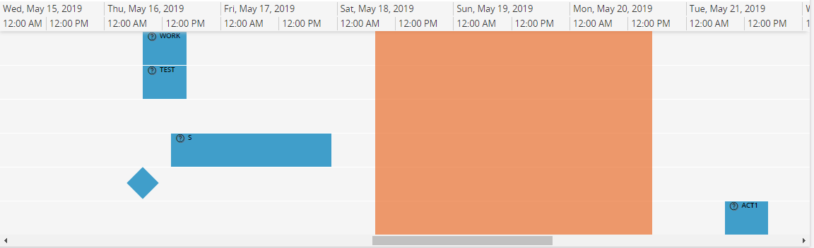
Figure 13 - Gantt Chart - Gantt Timemarkers
- Define a timemarker
     ganttcharttimemarker <gantt_chart_timemarker_name> for <entity_name> {
        starttime <start_time>;
        endtime <end_time>;
        emphasis = <emphasis_color>;;
    }
 `<gantt_chart_timemarker_name>` - Identity of the timemarker, this should be a meaningful identifier.
 `<entity_name>` - The [entity](../../110_projection_controls/entity/) timemarker is based on.
 `<start_time>` - Attribute for timemarker start.
 `<end_time>` - Attribute for timemarker end.
 `<emphasis_color>` - A value from the emphasis emphasis list.
    ---- Example code - Defining a Gantt Chart Timemarker ----
    ganttcharttimemarker ActivityLateDatesTimemarker for Activity {
        starttime FromTime;
        endtime ToTime;
        emphasis = Complementary8;
    }
- Add timemarker to gantt chart
ganttcharttimemarker <gantt_chart_timemarker_name>(<timemarker_array>);
 `<gantt_chart_schedule_name>` - Identifier for Gantt chart timemarker.
 `<timemarker_array>` - An array which provides data to populate timemarker information.
    ------ Example code - Adding to Gantt Chart ------
    ganttchart ProjectGantt for Project {
        ganttcharttimemarker ActivityLateDatesTimemarker(ActivityLateDates);
    }
16. Subscribe to other Gantts/Charts
This functionality relates to publisher-subscriber model. Adding subscribable property makes a chart eligible to receive notifications to redraw itself when the selection in a publisher chart changes. The following is a code example implementation of subscribable.
- Using Subscribable in Gantt Chart
ganttchart ProjectGantt using Projects {
   subscribable = [true];
}
- Using Publisher Parents in Gantt chart This functionality relates to publisher-subscriber model. Adding publisherparents property specifies set of publishers, who can send notifications to this chart. The following is a code example implementation of publisher parents.
ganttchart ProjectGantt using Projects {
   publisherparents = <Gantt_Chart_name>, <Bar_Chart_name>, <Pie_Chart_name>;
}
17. Timescale Configurations
Allow the developer/ end user to configure the timescale. The timescale is now separate from the zoom functionality.
- Define property inside GanttChart
ganttchart <gantt_chart_name> for <entity> {
 timescale{
              autoswitch = [<true|false>];       <br/>              primary = [<primary_timescale> ];  <br/>              secondary = [ <secondary_timescale> ];  <br/>  } <br/><br/>}<br/><br/> <br/>
`<primary_timescale>` - Possible primary timescales: Year, Quarter, Month, Week, Day, Hour
 `<secondary_timescale>` - Possible secondary timescales: Year, Quarter, Month, Week, Day, Hour
---- Example code - Defining timescale in Gantt Chart ----
 ganttchart ProjectGantt for Project {
   timescale{
   autoswitch = [false];
   primary = [ Year ];
secondary = [   Month ];
  }

}
18. Color By
Items in Gantt can be grouped by criteria defined by developer and each group has a unique color. When enabled by user, items will have the color of group which it belongs to. There are two ways to group items.
- User can use one or more attributes from data source which Gantt item is connected. User can switch between grouping attributes from a dropdown in toolbar. Value of the attribute is used to group items. Value and the color assigned to it will be displayed on the toolbar. Items with that value will have the assigned color of that group.
-
Items can be grouped using an external entity as well. Developer must define an array which will return key value pair. Here key is used for grouping criteria.
-
Define grouping criteria
 itemgroupings {
      itemgroup <attribute> {
       label = "<item_group_label>";
       emphasis <emphasis_color> =  <emphasis_condition>;

      }

  itemgroup <key_attribute>( <array>) {
         label = "<item_group_label>";
         value <value_attribute>;
      }

      default {
         // This is used for colors applied from ganttchartitem styles.
         label = "<item_group_label>";
      }
}
`<attribute>` - Attribute of the connected entity. This defines the grouping criteria.
 `<item_group_label>` - Label which shows to the user in the dropdown.
 `<emphasis_color>` - Optional property. Developer can assign an emphasis conditionally. If this property is not defined or condition is failed. Random color is assigned.
 `<emphasis_condition>` -Condition which evaluates to either true or false.
 `<key_attribute>` - This attribute is from the external entity and used as the grouping criteria. Value of this attribute is displayed on the dropdown.
 `<array>` - Array which returns the data set for grouping item. The data set must have �key\_attribute� and �value\_attribute�.
 `<value_attribute>` - Value in this attribute is used for the grouping of items
---- Example code - Defining Color By ----
Ganttchartitem ActivityItem for Activity {
itemgroupings {
      itemgroup Description {
         // An attribute from entity.
         label = "Description";
         defaultselected = [true]; //this entry will be selected by default
      }

      itemgroup ActivityClassId(ActivityClassArray) {
         label = "Activity Class";
         value Value;
      }
}
}
}
19. Collapsing Non-Working Time
Developer can set whether user can collapse non working time from the Gantt. When this property is set to true, toggle switch will be enabled in the settings panel. When switched on by the user, it will remove non working time periods from the Gantt time line with a buffer time of 30mins.
- Define property inside 'ganttchart'
  collapsenonworkingtime {
      enabled = [<true|false >]; <br/>       label = "<label>";  <br/>   } <br/>
20. Multi Select
It is possible to multi select ganttitems and execute a command. User needs to click and hold ctrl key while selecting items. If a card had open, it will be disappeared when user click the ctrl key. Click on empty row to deselect the selection.
Behaviour
- Each ganttchartitem can be independently set its type can be multi selected or not.
- items property in multiselection determines other types of ganttchartitems which can be selected. In multi selection, item selected for first is source item. Depending on that it is determined other ganttchartitem types which can be selected.
-
Command will be displayed in the toolbar which can be used to perform an action on selected items. Keyref of all the selected items will be passed to the command defined in ganttchart.
-
Enable Multi selection in ganttchart
ganttchart <gantt_chart_name> for <entity> {
multiselect {
label = "<label>";
icon = "<icon_nam>"
enabled = [<true|false>]; <br/>execute { <br/>actions_to_perform><br/>} <br/>} <br/><br/>} <br/>
`<label>` - Will be used as tooltip for multi select command.
 `<icon_name>` - Name of the icon, which will be displayed on the command.
 `<actions_to_perform>` -  Logic which will run when user click on the command.
- Enable multi select in item level
ganttchartitem <gantt_chart_item_name > for <entity > {
   multiselection {
      enabled = [<condition >];
      items = <item_names >;
   }
}
`<condition>` - Determines if these items can be multi selected
 `<item_names>` - Other items which can be selected if this is the source item. Comma separated names.
ganttchart ProjectGantt for Project {
   multiselect {
      execute {
         info("${Selection}"); //Selection property will hold the Keyrefs of all selected items
      }
   }

}


ganttchartitem ProjectGantt for Project {
    multiselect {
        enabled = [false];
    }
}


ganttchartitem SubProjectItem for SubProject {
   multiselection {
      enabled = [true]; // determines if these items can be multi selected
      items = ActivityItem; // other items which can be selected if this is the source item
   }
}


ganttchartitem ActivityItem for Activity {
   multiselection {
      enabled = [true];
   }

}
21. Snaptime Configurations
Gantt chart items can be dragged and resized. Snaptime indicates the interval that your items can be dragged or resized. .
- Define property inside GanttChart
ganttchart <gantt_chart_name> for <entity> {
snaptime {
 value = [<number>];
 unit = [<unit>];
}
}
`<number>` - Non negative integer. Should be less than 1000
 `<unit>` - Possible units: Minute, Hour, Day, Week, Month, Year
---- Example code - Defining timescale in Gantt Chart ----
ganttchart ProjectGantt for Project {
snaptime {
      value = 1;
      unit = Day;
}
}
22. Expand the top-level node by default
The datagrid is the tree like structure on the left of the chart. It can be a flat structure or a hierarchical structure depending on how the Gantt chart is defined. In a hierarchical Gantt chart the user can expand its child nodes. When the user queries for a single node (this is a GanttRow in your datagrid) the Gantt chart will itself expand the top-level node by default.
- Define property inside GanttChart
ganttchart <gantt_chart_name> for <entity> {
expandrootlevel =  [<true|false>]; <br/>}<br/> <br/>   <br/>
---- Example code - Defining timescale in Gantt Chart ----
ganttchart ProjectGantt for Project {
   expandrootlevel = [true];

}
The Gantt chart will expand only the top-level (root node) by default. Child nodes will not be expanded by default
23. Gannt Find
If ganttfields are declared in ganttchartitem, user can perform a quick search using values of those ganttfields. Click on the button with binocular icon to open the search panel. Then select value from the dropdown and enter a key word to be searched. User can navigate between search result using arrow icons. Items does not meet search criteria will be faded out.
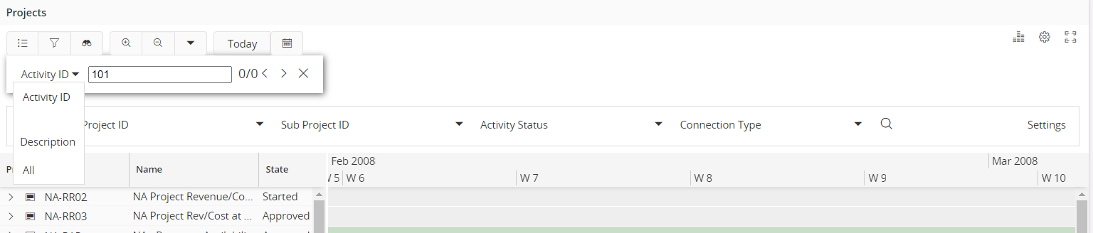
Figure 14 - Gantt Chart - Gantt Find
23. Jump to Date
Jump to date functionality allows the user to quickly navigate to the selected date. Click on Date Picker next to Today button which can be found in toolbar. Select the desired date and the Gantt chart will change the focus to the selected date.
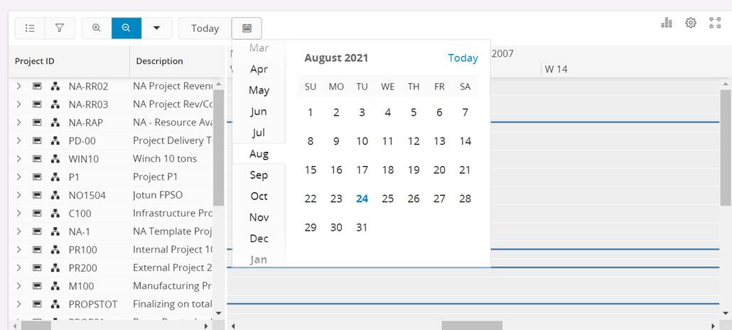 Figure 15 - Gantt Chart - Jump to dev
Keywords
Below is a list of keywords used within the control.
using | bind | for | clone | array | reference
Properties
Below is a list of properties that can be used to customize the control.
1. ganttchart reference
2. ganttchart
label | zoomlevel | snaptime | height | currenttime | datagrid | ganttchartitem | ganttchartrow | scheduleid | ganttchartschedule | ganttcharttimemarker
3. ganttchartitem
starttime | endtime | card | ganttchartitemstyle | ganttfield | ganttdependency | create command | resize command | move command | delete command | edit command
4. ganttchartrow
datagrid | ganttchartitem | ganttchartrow | scheduleid | ganttchartschedule | orderby
5. ganttchartitemstyle
label | shape | emphasis | icon
6. ganttchartschedule
ganttchartschedule | schedulestart | scheduleend | ganttchartitemstyle
7. ganttchartlegend
legendgroup | label | collapsed | ganttchartitemstyle | ganttchartrowicon
8. ganttdependency
dependencytype | fromitem | toitem
9. ganttcharttimemarker
label | starttime | endtime | emphasis
Example
Below is an example of a Gantt chart with multiple settings.
page ProjectGantt using Projects {
   label = "Project Gantt Chart";
   searchcontext PageSearchContext {
      defaults = GetPageSearchContextDefaults();
   }
   ganttchart ProjectGantt using ProjectRows {
      label = "Text";
      searchcontext GanttSearchContext {
         defaults = GetGanttSearchContextDefaults();
      }
      filter = [PlanStart > PageSearchContext.FromDate and PlanFinish < PageSearchContext.ToDate and EarnedValueMethod = GanttSearchContext.EarnedValueMethod];
      ganttchartlegend ProjectLegend;
   }
}
ganttchart ProjectGantt for Project {
   label = "Project Gantt";
   timescale = Day;
   zoomlevels(Year, Month, Day, Hour);
   datagrid {
      ganttcolumn ProjectId {
         label = "Project Id";
      }
      ganttcolumn Name;
      card ProjectCard;
   }
   ganttchartitem ProjectItem(ProjectItemArray);
   ganttchartrow SubProjectRow(SubProjectArray);
   scheduleid ProjectCalendarId;
   ganttchartschedule WorkingShiftSchedule(WorkingTimeArray);
   ganttcharttimemarker ActivityLateDatesTimemarker(ActivityLateDates);
}
ganttchartitem ProjectItem for Project {
   ganttfield ProjectId;
   starttime PlanStart;
   endtime PlanFinish;
   card ProjectCard;
   ganttchartitemstyle ProjectGanttStyle = [true];
}
ganttchartrow SubProjectRow for SubProject {
   datagrid {
      ganttcolumn SubProjectId;
      ganttcolumn Description;
   }
   ganttchartitem SubProjectItem(SubProjectItemArray);
   ganttchartrow ChildSubProjectRow(ChildSubProjectArray);
   ganttchartrow ActivityRow(ActivityArray);
   scheduleid ProjectCalendarId;
   ganttchartschedule WorkingShiftSchedule(WorkingTimeArray);
}
ganttchartitem SubProjectItem for SubProject {
   starttime EarliestStart;
   endtime LatestFinish;
   card SubProjectCard;
   ganttchartitemstyle SubProjectGanttStyle = [true];
   ganttfield SubProjectId;
}
ganttchartrow ChildSubProjectRow for SubProject {
   datagrid {
      ganttcolumn SubProjectId;
      ganttcolumn Description;
   }
   ganttchartitem SubProjectItem(SubProjectItemArray);
}
ganttchartrow ActivityRow for Activity {
   datagrid {
      ganttcolumn ActivityNo;
      ganttcolumn Description;
   }
   orderby = ActivityNo;
   ganttchartitem ActivityItem(ActivityItemArray);
   scheduleid ProjectCalendarId;
   ganttchartschedule WorkingShiftSchedule(WorkingTimeArray);
   ganttdependency GanttActivityDependency(DependencyArray);
}
ganttchartitem ActivityItem for Activity {
   itemid = "${ActivitySeq}";
   starttime EarlyStart;
   endtime EarlyFinish;
   card ActivityCard;
   ganttchartitemstyle ActivityGanttStyle = [TotalFloat != 0];
   ganttchartitemstyle CriticalActivityGanttStyle = [TotalFloat = 0];
   ganttchartitemstyle MilestoneActivityGanttStyle = [TotalWorkDays = 0];
   ganttfield ActivityNo;
   create command {
      label = "Activity";
      enabled = [true];
      execute {
         dialog CreateActivity(ProjectId, SubProjectId, Manager, "AllConnectedObjects", "ConnectedObjects", EarlyStart, EarlyFinish) {
            when OK {
               exit OK;
            }
            when CANCEL {
               exit CANCEL;
            }
         }
      }
   }
   resize command {
      enabled = [true];
      execute {
         confirm("Do you want to save the changes?") {
            when OK {
               call ResizeActivity(EarlyStart, EarlyFinish);
            }
            when CANCEL {
               refresh;
            }
         }
      }
   }
   move command {
      enabled = [true];
      execute {
         confirm("Do you want to save the changes?") {
            when OK {
               call ResizeActivity(EarlyStart, EarlyFinish);
            }
         }
      }
   }
   delete command {
      execute {
         confirm("Do you want to delete the selected activity?") {
            when OK {
               call RemoveActivity();
            }
         }
      }
   }
}
ganttchartschedule WorkingShiftSchedule for WorkTimeCalendar {
    scheduleid CalendarId;
    schedulestart FromTime;
    scheduleend ToTime;
    ganttchartitemstyle OvertimeStyle = [true];
}
ganttdependency GanttActivityDependency for ActivityDependency {
   dependencytype StartToStart = [DependencyType = "StartToStart"];
   dependencytype StartToFinish = [DependencyType = "StartToFinish"];
   dependencytype FinishToStart = [DependencyType = "FinishToStart"];
   dependencytype FinishToFinish = [DependencyType = "FinishToFinish"];
   fromitem = "${PredecessorActivitySeq}";
   toitem = "${SuccessorActivitySeq}";
}
ganttchartitemstyle ProjectGanttStyle {
   emphasis = True;
   shape = bracket;
}
ganttchartitemstyle SubProjectGanttStyle {
   emphasis = Complementary10;
   shape = bracket;
}
ganttchartitemstyle ActivityGanttStyle {
   emphasis = Primary;
   shape = default;
}
ganttchartitemstyle CriticalActivityGanttStyle {
   emphasis = Danger;
   shape = default;
}
ganttchartitemstyle MilestoneActivityGanttStyle {
   emphasis = Primary;
   shape = diamond;
}
ganttchartlegend ProjectLegend {
   legendgroup ItemLegendGroup {
      label = "Items";
      ganttchartitemstyle ProjectSummaryStyle;
      ganttchartitemstyle SubProjectSummaryStyle;
      ganttchartitemstyle ActivityItemStyle;
      ganttchartitemstyle ActivityMilestone;
      ganttchartitemstyle ActivityFloatStyle;
      ganttchartitemstyle ActivityConstraintStyle;
   }
   legendgroup ScheduleLegendGroup {
      label = "Schedule";
      collapsed = [true];
      ganttchartitemstyle OvertimeStyle;
   }
   legendgroup RowIconLegendGroup {
      label = "Row Icons";
      collapsed = [true];
      ganttchartrowicon ProjectRowIcon;
   }
}
ganttcharttimemarker ActivityLateDatesTimemarker for Activity {
   label = "Some Label";
   starttime LateStart;
   endtime LateFinish;
   emphasis = Complementary8;
}