List
Lists are used to view or edit multiple records on a single page. The list control supports multiple views such as the list view, table view, card view and touch list view.
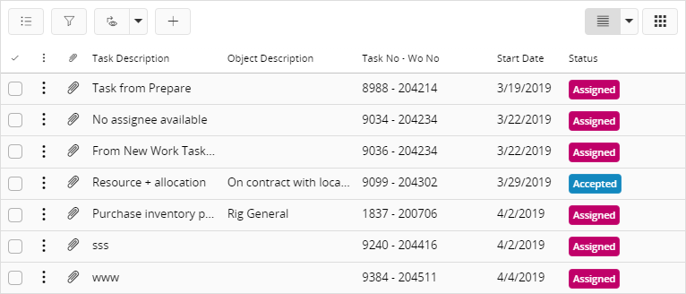
Figure 1 - List Control - List View
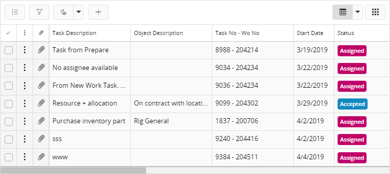
Figure 2 - List Control - Table View
For small touch devices (e.g. mobile phones) held in portrait orientation, the list and table views are replaced by the touch list view which provides a better user experience for the smaller screen estate.
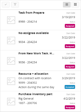
Figure 3 - List Control - Touch List View
Tile view also can be used as a list view mode. More appropriate for where list is placed in a narrow spaces. example : left pane
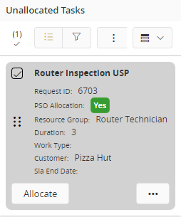
Figure 4 - List Control - Tile List View
Variations
The Box-matrix, Card and Tile controls are variations of the List control.
When to use
Use the List control when you want to display an overview of records or when you want the user to be able to edit multiple records at the same time.
Limitations
None.
How to use
Follow the steps below to add a list to a page:
1. Define a list
Define a list in the client model file using the following format:
list <list_name> for <entity_name> {
   ...
}
<list_name> - Identity of the list, always use a meaningful identifier.
<entity_name> - The entity the list is based on, see example below:
//Example code
//-------------
list StagedBillingTemplateLineList for StagedBillingTemplate {
   ...
}
2. Add the list to the container
Add the list to a page, modal assistant, section, tabs and cards (known as sheets). A list gets its values from a data source which is either an entityset, an array or reference:
page  {
list <list_name> using <entityset_for_list>;
}
<entityset_for_list> - This is the entityset that serves as the datasource from which the list gets its values. The entityset must be based on the same entity that was used to define the list.
page <page_name> using <entityset_for_page> {
    list <list_name>;
}
This method is useful if the purpose of the page is to display a list of records. In such instances it is not mandatory to define an entityset for the list since it gets its values from the <entityset_for_page>.
//Example code Method 2
//----------------------
page List using ActiveSeparateSet {
    list WorkOrderList;
}
page <page_name> using <entityset_for_page> {
    list <list_name>(<list_array>);
}
<list_array> - This is the array or reference defined in the related projection file.
Most of the time an array or reference is connected to a parent record and needs to be updated when the parent record is changed. In such instances the list needs to be bound to the control which has the parent record, for example a selector or another list. The binding is done using the bind keyword.
page <page_name> using <entityset_for_page> {
    selector <selector_name>;
    list <list_name>(<list_array>) bind <selector_name>;
}
//Example code Method 3
//----------------------
page Form using ServiceInvoiceSet {
    selector ServiceInvoiceSelector;
    list ServiceInvoiceLineList(ServiceInvoiceLineArray) bind ServiceInvoiceSelector;
}
- Add the list to use a function that returns an entity collection:
page <page_name> {
    list <list_name> using <function_set>;
}
<function_set> - This is the function defined in the related projection file that returns an entity collection. Function should return the same type entity collection as the list is based on. Function parameters can get values from several places like the current record of the page, Global context, Search context, etc.
//Example code Method 4
//----------------------
page Form using ServiceInvoiceSet {
    selector ServiceInvoiceSelector;
    list ServiceInvoiceLineList using GetInvoiceLines(InvoiceNo, context.Company)
}
3. Set the appropriate properties for the list
Set one or more properties for the list such as label, initial view, edit mode etc. For a complete list of the properties and how to set them see the Properties section below.
4. Add content to the list
Content for a list can be added in the form of fields and commands
- Fields - Add the fields that should be displayed as columns in the list. The following type of fields are supported within a list: text, lov (list of values), date/time, enumeration, measure/currency, boolean, badges, rating control, static, and contact widgets. Each field can be customized through the use of its own properties.
//Example code - Adding fields to a list
//--------------------------------------
list ActivityList for Activity {
    //List content
    field ActivityNo {
        editable = [false];
    }
    field LoggedInUser {
        contactwidget {
                enabled = [true];
            }
        }
    field Description {
        maxlength = 200;
        size = Large;
        }
    lov MainRepresentativeRef with RepresentativeSelector using Representatives {
        label = "Main Representative";
        description = MainRepresentativeName;
        details = RepresentativeInfo;
        }
    field StartDate;
    field ConnectionId;
    field UserRating {
        rating {
            showlabel = true;
            maxrating = 5;
        }
    }
    badge CalendarActivityType {
        emphasis Complementary1 = [CalendarActivityType = "TASK"];
        emphasis Complementary2 = [CalendarActivityType = "APPOINTMENT"];
        visible = [CalendarActivityType != null];
    }
}
- Commands - In addition to fields/columns you can also add commands to the list. The commands need to be defined separately and then added within the definition of the list. All commands will appear above the list (below the title) as well as on the row level command menu.
//Example code - Adding commands to a list
//----------------------------------------
command GoToRepresentative {
    label = "Representative Info";
    enabled = [true];
    mode = SingleRecord;
    execute {
        navigate RepresentativeInfo("RepresentativeId eq $[MainRepresentativeId]");
    }
}
list Activity for Activity {
    // List content
    command GoToRepresentative;
}
- Group fields and commands - Both fields and commands can be grouped.
- Grouping Fields:
Fields in a list can be grouped by creating a grouping field set and adding grouping fields to it. Make sure that the attributes are from the same entity used by the list. Use the
enabledproperty of the grouping field for scenarios where you would need to enable or disable a grouping field based on other grouping conditions (see example code below).
//Example code - Adding grouping fields to a list
//-----------------------------------------------
groupingfieldset OrderListGroup for Order {
    label = "Items will be grouped based on";
    groupingfield Site;
    groupingfield CustomerNo {
        enabled = [Site = true]; // Enable only if Site is included in grouping
    }
    groupingfield ContactPersonId;
}
list OrderList for Order {
    label = "Order List";
    groupingfieldset OrderListGroup;
    field Company;
    ....
}
- Grouping Commands: Commands can be grouped by using a command group. Please refer to the relevant section under commands.
5. Set the initial view of the list
Apart from the standard list and table views, you can also configure the list to display card, box-matrix, and avatar views.
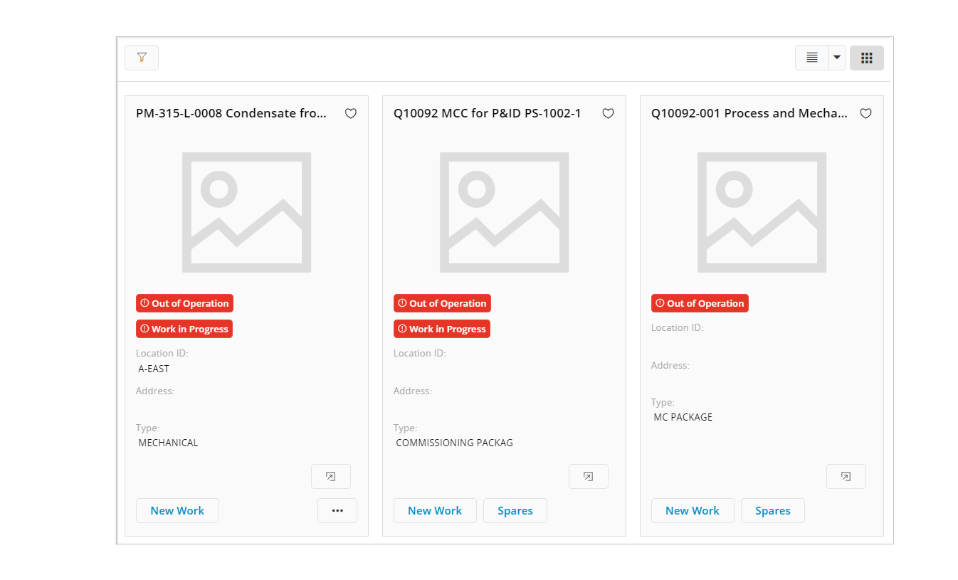
Figure 4 - List Control - Card View
These additional views can be set as the initial view of the list and will be stored in the user's profile. To set one of these views as the initial view, add the relevant control to the list set the relevant values against the initialview property.
//Example code - Setting the initial view
//---------------------------------------
list CustomerList for Customer {
   label = "Customer";
   initialview = CardView;
   card CustomerCard;
   field Company;
   field CustomerNo;
   field CustomerName;
   field CreditRating {
      rating {
         showlabel = true;
         maxrating = 7;
      }
   }
}
card CustomerCard for Customer {
    //Card definition
}
Tile View
Figure 5 - List Control - Tile View
These additional views can be set as the initial view of the list and will be stored in the user's profile. To set one of these views as the initial view, add the tile property to the list set the tile-view value against the initialview property. Does not need to define separate tile for tile view. Can use tile syntax directly
//Example code - Setting the initial view
//---------------------------------------
list CustomerList for Customer {
   label = "Customer";
   initialview = TileView;
   tile CustomerList;
   field Company;
   field CustomerNo;
   field CustomerName;
   field CreditRating {
      rating {
         showlabel = true;
         maxrating = 7;
      }
   }
}
6. Enable/Disable CRUD Actions
You can enable or disable CRUD actions based on conditions as shown below:
//Example - Enable/Disable CRUD Actions
//-------------------------------------
list OrderLinesList for CustomerOrderLine {
   crudactions {
      new {
         enabled = [parent.Objstate = "Opened"]; //Enable adding new order lines to "Opened" orders
      }
      edit {
         enabled = [parent.Objstate != "Closed"]; //Disable editing order lines in "Closed" orders
      }
      delete {
         enabled = [DeliveryConfirmed = false]; //Disable deleting order lines in state "DeliveryConfirmed"
      }
   }
Note: For the
newandeditCRUD actions you have to use values from the parent record since the buttons are common to the entire list; they should not depend on a particular record. Thedeleteaction however can use values from the selected record.
7. Dragging rows in the List
Rows in a list can be dragged into several elements in the page. such as gantt chart and map. To enable the dragging into particular element, have to define related fields mapping for required attributes of the drop element.
example :-
List OrderDetailsList from OrderDetails {
    label = "Order Details";
    drag {
        ganttchart {
            duration JobDuration;
        }
    }
}
Here duration is the mandetory field to drag a list row to gnatt chart. Hence related attribute should be given todrow the gantt item correctly in the bantt chart.
Drag feature will be enabled with drag syntax.
8. Select how data and columns should be displayed
Use the properties fieldranking, orderby, summary, and defaultfilter to set how data and columns should be displayed in the list.
Keywords
Below is a list of keywords used within the control.
using | bind | for | clone
Properties
Below is a list of properties that can be used to customize the control.
copyoncruddefault | collapsed | defaultfilter | details | display | editmode | fieldranking | filter | initialview | label | multiselect | orderby | preselect | savemode | summary | visible | tile
Example
Example 1 - List with multiple settings
Below is an example of a list with multiple settings.
page OrderDetails using OrdersSet {
    label = "Order Details";
    selector OrderSelector;
    group OrderBasicDetails;
    list OrderLinesList(OrderLinesArray) bind OrderSelector {
        visible = [Objstate != "Depricated"];
        details = LineDetails(LineNo);
        filter = [LineCompany = Company];
        copyoncruddefault(Company, DeliveryType)to(LineCompany, DeliveryType);
    }
}
list OrderLinesList for OrderLine {
label = "Customer Orders";
initialview = ListView;
preselect = [true];
editmode = SingleCellEdit;
orderby = LineNo, DeliveryType desc;
defaultfilter = [LineCompany != null];
card OrderLineCard;
crudactions {
new {
enabled = [parent.Objstate = "Opened"];
}
edit {
enabled = [parent.Objstate != "Closed"];
}
delete {
enabled = [DeliveryConfirmed = false];
}
}
static LineNo;
static LineCompany;
static Description;
field ContactPersonId {
contactwidget {
enabled = [true];
source = Person;
}
}
badge DeliveryType {
emphasis Complementary1 = [DeliveryType = "Prime"];
emphasis Complementary2 = [DeliveryType = "Regular"];
emphasis Complementary3 = [DeliveryType = "Custom"];
}
field Objstate {
label = "Status";
}
field StartDate {
format = longtime;
columnexclude = [parent.Objstate = "Closed"];
searchable = true;
}
daterangefield {
startdate StartDate;
enddate EndDate;
label = "Validity Period";
searchable = false;
}
lov CustomerRef with CustomerSelector {
label = "Customer ID";
description = CustomerRef.Name;
}
field CustomerRef.CustGrp {
columnvisible = [false];
}
field AvailableForPickup {
truelabel = "Available";
falselabel = "Unavailable";
}
field NetAmount;
field GrossAmount;fieldranking OrderNo, Description, AvailableForPickup, NetAmount, GrossAmount;
summary = NetAmount, GrossAmount;command GotoOrderDetails;
command DispatchOrder;
}
Example 1 - List with multiple settingsExample 2 - Nested Lists
An example of nesting lists inside a tab control:
tabs {

    tab {

        label = "Disposition Lines";
    list DispositionLinesList(ShopOrdDispoLineArray) {

        ...

    }
    list LotBatchSerialRecordList(DispoLineSerialArray) bind DispositionLinesList {

        label = "Serial Details";

        display = Nested;

        ...

    }

    ...
Example 2 - Nested Lists 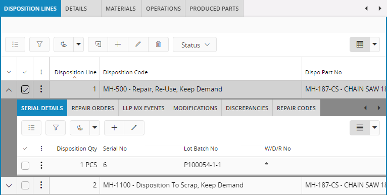 Figure 5 - List Control Example - Nested lists