Contact widget
A contact widget is a small card which shows information about a person, supplier, customer, or user. For example, the information that shows for a person can be an image, name, phone number, mobile number, and email.
NOTE! The person widget is now deprecated, and have to be replaced with contact widget in existing client files.
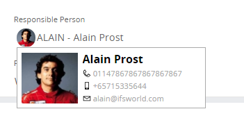
Figure 1 - Contact widget control with contact information
Variations
None.
When to use
Use a contact widget client control to display contact information for a person, supplier, customer, or user.
A contact widget can be used in fields, calendar, timeline, lovs, cards etc. If you can get person ID as an attribute, it can be bound to the contact widget.
For example, if a field shows a person’s name, a contact widget can be bound to this. Once a user clicks on it, a small card then pops up that displays information about this person.
The user can then contact the person by clicking on any communication method on the card.
How to use
The code below is used to add a contact widget to a field:
contactwidget {
    enabled=[<true/false>];
    source = [<Person/Supplier/Customer>];
    key=<The column which contains user ID>;
}
There are three fields in the contact widget option, these are:
- enabled: enabling and disabling can be done from this flag.
- source: this attribute sets the theme of the contact widget. It is either Person, Supplier, Customer, or User.
- key: this is the column where the persons ID can be extracted. This is an optional field. If your field contains the person’s ID then you don’t need this field. Otherwise you need to assign the relevant column to this field. If there is no column for the person ID in you entity then you need to override the entity and get the column (see example below).
field AuthorizerName{
   editable = [true];
   visible = [true];

   contactwidget {
     enabled=[true];
     source = Supplier;
     key=Authorizer;
   }
}
In this case the field contains the Authorizer Name. So the key option should be assign with an ‘Authorizer’ column.
Limitations
Navigation to a detailed page (or other destination), is not possible using a contact widget.
Usage of multiple values for one field is not supported on a contact widget. For example, if there are multiple mobile numbers for one user, then the contact widget only shows the default number.
The flexibility to add or remove fields on a contact widget is not supported.
Properties
Below is a list of properties that can be used to customize the control.
Example
Below is an example of how a contact widget is used to....
field Reference {
  contactwidget {
     enabled = [true];
     source {
        Person = [RefTypeDb = "PERSON"];
        Customer = [RefTypeDb = "CUSTOMER"];
        Supplier = [RefTypeDb = "SUPPLIER"];
     }
     key = RefId;
  }
}
Example - Contact widget example