Item Picker
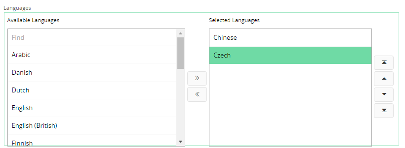
The item picker control is used to show a subset of items that are selected by the user from a set of many items.
 Figure 1 - Item Picker Control
Variations
None.
When to use
Use this control when you want the user to select multiple items from a given list of items. It could be that the user wants to view items that are selected vs. those that are not or the user wants to store the selected items in a particular order.
Limitations
None.
How to use
Follow the steps below to add an item picker to a page:
1. Define the item picker
Item picker must be declared inside a group. It has the following syntax.
itempicker <attribute> using <referenced_entityset> {
    displayvalue = <referenced_attribute>;
    }
<attribute> - Attribute of the entity of the group in which the item picker resides in which the selected items will be stored.
<referenced_entityset> - The entityset from which the items are selected to display in the item picker.
<referenced_attribute> - The attribute that belongs to the entity of the referenced entityset, which holds the values that will be displayed as the items in the item picker lists.
Consider the below example,
//Example Code
//------------
itempicker CompanyTransLngCodes using CompanyTranslationLngSet {
    displayvalue = Description;
    }
In the above example, the field CompanyTransLngCodes is defined as an item picker. The items that will be imported into the control are from the CompanyTranslationLngSet entityset.
Description is the attribute which belongs to the CompanyTranslationLngSet entityset. The values found in this attribute is what will be displayed to the user.
2. Declare the referenced_entityset in the projection
In the.projection file declare the entityset from which the items of the item picker will be fetched. If necessary you can override the entity or declare the query that is necessary for the entityset as well.
entityset CompanyTranslationLngSet for CompanyTranslationLng;
query CompanyTranslationLng {
    from = "company_translation_lng";
    keys = KeyName, KeyValue, LanguageCode;
    attribute KeyName Text;
    attribute KeyValue Text;
    attribute LanguageCode Text;
    attribute Description Text;
}
Once the user selects some items, it is the keyrefs of the selected items that will be saved with the corresponding field in the record as a JSON array. An example is shown below.
["KEY_NAME=TemplKeyLu^KEY_VALUE=STD^LANGUAGE_CODE=cs^","KEY_NAME=TemplKeyLu^KEY_VALUE=STD^LANGUAGE_CODE=zh^"]
Keywords
None.
Properties
Below is a list of properties that can be used to customize the control.
availableitemslabel | compactmode | displayvalue | editable | enableordering | filter | label | orderby | selecteditemslabel | visible
Example
Example1 - Item Picker with multiple settings
Below is an example of an item picker with multiple settings.
itempicker CompanyTransLngCodes using CompanyTranslationLngSet {
    label = "Languages";
    availableitemslabel = "Available Languages";
    selecteditemslabel = "Selected Languages";
    displayvalue = Description;
    compactmode = [false];
    enableordering = [true];
    orderby = Description asc;
    visible = [SourceCompany != null];
    filter = [KeyValue = SourceCompany];
    editable = [SourceCompany != null];
}
Example 1 - Item Picker declaration with multiple settings
 Figure 2 - Item Picker with multiple settings
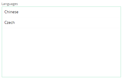
However if the compactmode property is set to true the item picker control will look like below.
 Figure 3 - Item Picker Control in Compact mode
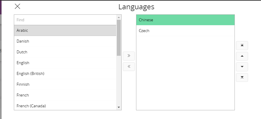
Values in the item picker can be edited by clicking the control. A dialog will pop up to edit the values.
 Figure 4 - Popup dialog in the Item Picker