Check Box
The Check Box control displays the state of a checkbox.
To include this control in your report, simply drag the Check Box item from the Toolbox and drop it onto the desired location within the report's area.

You can set the checkbox's state using one of the following properties:
- Checked: This property indicates whether the checkbox is selected (displaying a check mark) or not (empty).
- Check State: This property specifies one of the following checkbox states:
| Icon | Check State |
|---|---|
 | Unchecked |
 | Checked |
 | Indeterminate |
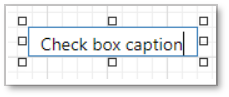
The Text property defines the caption displayed alongside the checkbox. To set the text, double-click on the checkbox to invoke its in-place editor, and then type the desired text.
Bind to Data
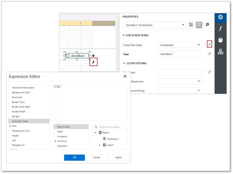
To bind the Check State property to a data field from the report's data source, navigate to the Properties panel and expand the Check Box Tasks category. Click on the marker for the Check State property, then click on the f to get the "Check State Expression". In the Expression Editor, choose the desired data field. This allows the checkbox's state to dynamically reflect the value of the selected data field.
The checkbox's state is determined by the value of the associated data field in the following manner:
- If the value is True or 1, the checkbox is activated and displays the Checked state.
- If the value is False or 0, the checkbox is activated and displays the Unchecked state.
- Any other value activates the Indeterminate state.
Similarly, to bind the Text property, click on f to get the"Text Expression," and then choose a data field or construct a complex binding expression involving multiple data fields. This allows the text displayed alongside the checkbox to be dynamically determined by the selected data field(s).

You can also create a new checkbox bound to a Boolean-type data field by simply dragging and dropping the field from the Field List onto the report. This automatically generates a checkbox control linked to the selected data field.
Interactivity
To enable changing the checkbox state within Print Preview, set the option "Edit Options | Enabled" to "Yes." This allows users to interact with the checkbox and modify its state directly in the Print Preview mode.
The Group ID setting defines the checkbox's behavior in Print Preview:
- When you set this property to an empty string value, a checkbox can be switched to either the "checked" or "unchecked" state independently of other available checkboxes.

- Otherwise, the field editor behaves like a radio button, and editors that have the same ID belong to a single logical group (that is, only one option can be selected in a group at a time).
Glyph Customization
The Glyph Options property grants access to glyph settings.

- Alignment - specifies the glyph's alignment within the control.

- Size - specifies the glyph size.
- Glyph Style - specifies a predefined glyph style.

- Custom Glyphs - specifies a custom glyph image for each checkbox state (Checked/Unchecked/Indeterminate).
