Bar Chart
Bar charts can be generated inside page, card, arrange and tab definitions.
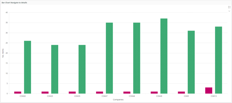
Figure 1 - Bar chart in page
Variations
None.
When to use
Follow the steps below to add a bar chart to a page.
Basic Bar Chart
First you have to create a data source in the projection file. Then you can connect it to the bar chart as follows.
barchart BarChartTest for ExampleBarChart {
    ..
}
When it comes to a basic bar chart it needs to have a label, x-axis and y-axis.
- Label: Title of the chart.
- x: Configurations of x-axis (Argument axis) of the chart.
- y: Configurations of y-axis (Value axis) of the chart.
The following code describes how to create a basic bar chart on Aurena pages.
------------- MAIN PAGES ---------------
page TestPage using BarChartEntityset {
   title = "Bar Chart Test Page";
   barchart BarChartTest;
}

------------ VISUAL COMPONENTS ----------
barchart BarChartTest for ExampleBarChart {
   label = "Title of Bar Chart";
   x {
      label = "Text for X axis";
      value ConnectionType;
   }
   y {
      label = "Text for Y axis";
      value Count;
   }
}
1. Define a bar chart
Define a bar chart in the client model file using the following format.
--------- Declarative syntax ---------
barchart <bar_chart_name> for <entity_name> {
   ...
}
<bar_chart_name> - identity of the bar chart, always use a meaningful identifier.
<bar_name> - The entity or the summary the bar chart is based on, see examples below:
--------- Example code ---------------
barchart OrderTypeBarChart for OrderTypeSummary {
   ...
}
2. Add the bar chart to the container
A bar chart can be added to a page, card, arrange, tab. A bar chart gets it's vales from a datasource which is either an an entityset, an array or reference:
page <page_name> {
    barchart <bar_chart_name> using <entityset_for_bar_chart>;
 }
<entityset_for_bar_chart> - This is the entityset that serves as the datasource from which the bar chart gets its values. The entityset must be based on the same entity that was used to define the bar chart.
----------- Example code Method 1 ----------------
      page BarChart using OrdersSet {
        barchart OrderCategoriesBarChart using OrderCategoriesSet;
    }
---------- Declarative syntax ---------------
    page <page_name> using <entityset_for_page> {
        barchart <bar_chart_name>;
    }
This method is useful if the purpose of the page is to display a bar chart of records. In such instances it is not mandatory to define an entityset for the bar chart since it gets its values from the <entityset_for_page>.
------ Example code Method 2 --------------
    page BarChart using OrderCategoriesSet {
        barchart OrderCategoriesBarChart;
    }
- Add the bar chart to use an array or a reference:
    page <page_name> using <entityset_for_page> {
        barchart <bar_chart_name>(<bar_chart_array>);
    }
<bar_chart_array> - This is the array or reference defined in the related projection file.
Most of the time an array or reference is connected to a parent record and needs to be updated when the parent record is changed. In such instances the bar chart needs to be bound to the control which has the parent record, for example a selector or a list. The binding is done using the bind keyword.
page <page_name> using <entityset_for_page> {
    selector <selector_name>;
    barchart <bar_chart_name>(<bar_chart_array>) bind <selector_name>;
}
------ Example code Method 3 --------------
page Form using OrdersSet {
    selector OrdersSelector;
    barchart OrderItemsBarChart(OrderItemsArray) bind OrdersSelector;
}
- Add the bar chart to use a function that returns an entity collection:
    page <page_name> {
        list <bar_chart_name> using <function_set>;
    }
<function_set> - This is the function defined in the related projection file that returns an entity collection. A function should return the same type of entity collection as the bar chart is based on. Function parameters can get values from several places like the current record of the page, global context, search context, etc.
------ Example code Method 4 --------------
page Form using ServiceInvoiceSet {
    selector ServiceInvoiceSelector;
    list ServiceInvoiceBarList using GetInvoiceBars(InvoiceNo, context.Company)
}
Adding a bar chart to a card
The below code snippets would show how bar chart could be integrated to a card (Only referenced bar chart could be generated).
(Parent-Child relationship [1-M])
card CardName for SomeEntity {
    barchart BarChartName(ChildArrayName);
}
3. Configuring bar chart axes
A bar chart has two axes. Two axes can be defined using x and y properties in marble.
Following is a simple code snippet that shows the way of defining two axes in marble.
barchart BarChartTest for ExampleBarChart {
   label = "Title of Bar Chart";
   x {
      label = "X axis title";
   }
   y {
      label = "Y axis title";
   }
}
‘x’ represents the x-axis and ‘y’ represents the y-axis.
Each bar chart axis has two main parts.
- label: The title of the axis.
- value: The attribute which offers values to the axis.
x {
   label = "Text for X axis";
   value ConnectionType;
}
y {
   label = "Text for Y axis";
   value Count;
}
4. Adding values to bar chart
X axis can only have one value. Y axis can have more than one value. A simple single series bar chart can be defined as follows.
barchart BarChartTest for ExampleBarChart {
   label = "Title of Bar Chart";
   x {
      label = "Employee Name";
      value Employee;
   }
   y {
      label = "Work Experience";
      value mathematics;
   }
}
Multiple Series
When it comes to multiple series bar charts y axis can have multiple values. Multiple series can be added to the bar chart in two ways.
- Adding multiple fields to y-axis:
y {
    label = "Count";
    value CountConnectionType;
    value CountMchCode;
}
Each attribute in y-axis represents one series.
- Splitting values in a column
    y {
        label = "Count";
        value CountMchCode;
        split {
            value ConnectionType;
        }
    }
In this case a series will be generated for each distinct value in the split field.
- Color Splitting values in a column
    y {
        label = "Count";
        value CountMchCode;
        colorsplit {
            value ConnectionType;
        }
    }
This selects the colour of a particular bar depending on the available values in a specified column for colorsplit.
5. Set the appropriate properties for the bar chart
Set one or more properties for the bar chart such as label, collapsed etc. For a complete bar chart of the properties and how to set them see the Properties section below.
6. Setting TopN values
The keyword topn is used to limit the number of visible x axis values according to different conditions. There are 3 modes in topn;
Note! Top N options can be used only in single series bar charts.
Mode 1 - Count
Is used to limit the number of slices by specifying the number slices to be shown.
barchart TopNTestBarChart for ItemSummary {
    label = "Bar Chart Top N Count(5)";
    orderby = CurrentCount asc;
    x {
        label = "Regions";
        value Region;
    }
    y {
        label = "No. Items";
        value CurrentCount;
        topn = Count(5);
    }
}
The above condition would make the bar chart to only show top 5 bars along with others bar.
Mode 2 - ThresholdValue
Is used to limit the number of bars by specifying a minimum value.
barchart TopNTestBarChart for ItemSummary {
    label = "Bar Chart Top N Threshold Value 100";
    x {
        label = "Regions";
        value Region;
    }
    y {
        label = "No. Items";
        value Count;
        topn = ThresholdValue(100);
    }
The above condition would make the bar chart to only show bars that have a value greater than or equal to 100.
Mode 3 - ThresholdPercent
Is used to limit the number of slices by specifying a minimum percentage of the total
barchart TopNTestBarChart for ItemSummary {
    label = "Bar Chart Top N Threshold Value 100";
    x {
        label = "Regions";
        value Region;
    }
    y {
        label = "No. Items";
        value Count;
        topn = ThresholdPercent(20);
    }
}
The above condition would make the bar chart to only show bars that has a percentage greater than or equal to 20 of the total.
In all of the 3 modes others bar would be shown along with bars which satisfied the given criteria. others bar represents the sum of all the other bars which didn’t satisfy the condition.
Others bar can be hidden using the showothers property.
y {
    label = "No. Items";
    value Count;
    topn = ThresholdPercent(20);
    showothers = [false] // default value is true
}
6. Setting custom colors on bar chart
There are two ways that you can use to color bars in bar charts. Although emphasis property has to be used in both ways.
- Using the chart emphasis property.
barchart BarChartTest for ExampleBarChart {
    label = "Title of Bar Chart";
    x {
        label = "Employee Name";
        value Employee;
    }
    y {
        label = "Work Experience";
        value mathematics;
    }
    emphasis Complementary1 = [XValueFieldName = "Something"];
    emphasis Complementary3 = [YValueFieldName = "Something"];
}
- Using the emphasis property inside value.
barchart BarChartTest for ExampleBarChart {
    label = "Title of Bar Chart";
    x {
        label = "Employee Name";
        value Employee;
    }
    y {
        label = "Work Experience";
        value Experience {
            emphasis Complementary1 = [ValueFieldName = "Something"];
        }
    }
}
7. Setting custom patterns on bar chart
When it comes to patterns too there are two ways of applying a patterns to bars in bar chart. In both ways pattern property has to be used.
1 - Using the pattern property inside chart
barchart BarChartTest for ExampleBarChart {
    label = "Title of Bar Chart";
    x {
        label = "Employee Name";
        value Employee;
    }
    y {
        label = "Work Experience";
        value Experience;
    }
    pattern fillpattern1 = [Experience = "Something"]
}
2 - Using the pattern property inside the value block
barchart BarChartTest for ExampleBarChart {
    label = "Title of Bar Chart";
    x {
        label = "Employee Name";
        value Employee;
    }
    y {
        label = "Work Experience";
        value Experience {
            label = "Experience"
            pattern fillpattern1 = [true]; //value true can be used
        }
    }
}
8. Adding constant lines
In bar charts constant lines can be added to both x and y axes. Following is the syntax of adding a simple constant line to the x axis of a bar chart.
barchart OrderItemBarChart for OrderItem {
    orderby = ItemSupplyDate asc;
    x {
        label = "Item Supply Date";
        value ItemSupplyDate {
            label = "Item Supply Date";
        }
        constantline {
            label = "Forecast Cut Off 1";
            value = "${parent.ForecastCutOff1}";
        }
    }
    y {
        label = "Quantity";
        value SupplyQuantity {
            label = "Supply Quantity";
            seriestype = line;
            seriesstyle = linepattern1;
            emphasis Complementary5 = [true];
        }
        value DemandQuantity {
            label = "Demand Quantity";
            seriestype = line;
            seriesstyle = linepattern6;
            emphasis Complementary6 = [true];
        }
    }
}
In the above code snippet, along with the constantline property, value property has been used as well. The reason of having value property inside constant line block is to give a certain value to the constantline and then it will be drawn based on that value on the corresponding axis.
Other than value and label properties, there are three properties available in constant line block.
1 - Pattern
This property is being used to add a line pattern to a constantline.
    constantline {
        label = "Forecast Cut Off 1";
        value = "${parent.ForecastCutOff1}";
        pattern linepattern7 = [true];
    }
2 - Emphasis
This property is being used to add a color to a constantline.
    constantline {
        label = "Forecast Cut Off 1";
        value = "${parent.ForecastCutOff1}";
        pattern linepattern7 = [true];
        emphasis Complementary5 = [true];
    }
3 - Visible
Using this property you can hide a particular constantline conditionally.
    constantline {
        label = "Forecast Cut Off 1";
        value = "${parent.ForecastCutOff1}";
        pattern linepattern7 = [true];
        emphasis Complementary5 = [true];
        visible = [true] // boolean value or a condition
    }
9. Changing series type
This functionality is available in bar and stacked charts. You can change the type of a bar or stacked series to line series using this property. The purpose of this feature is to make it possible to have multiple chart types in a single chart. This functionality supports two combinations.
- Bar chart with a line chart.
- Stacked chart with a line chart
Series type property is only available with bar and stacked chart syntaxes. The property value has to be set to “line” in order to change the series type to line.
value Total {
    label = "total";
    seriestype = line;
}
10. Navigate to details
There are two ways of implementing this. Either you can implement it in chart level or else you can implement it in series level. To add a series specific navigation link, you have to use the series level implementation as the chart level implementation will impact across all the series in a chart.
1 - Chart level implementation
    page ActivityPage using ActivityChartEntityset {
        title = "Activity Chart";
        barchart ActivityBarChart {
            details = ActivityDetailsPage(ActivityType, MainRepresentativeId);
        }
    }

    barchart ActivityBarChart for ActivityChartSummary {
        x {
            label = " Activity Type ";
            value ActivityType;
        }
        y {
            label = "Count";
            value CountActivityType;
            split {
                value MainRepresentativeId;
            }
        }
    }
Using this syntax you can specify the page to be navigated together with the parameters that need to be passed.
Also there's another way of specifying a pages to navigate. You can use a navigaiton URL for that. The following is an code example of that.
    page ActivityPage using ActivityChartEntityset {
        title = "Activity Chart";
        barchart ActivityBarChart {
            details = "page/CherlkBusinessActivity/ActivityPage?$filter=ActivityType eq $[ ACTIVITY_TYPE] and MainPrepresentativeId eq $[MAIN_REPRESENTATIVE_ID]";
        }
    }
2 - Series level implementation
The only difference here is that you can declare navigation URL specific to the series. The following is an code example implementation of this.
    barchart EmployeeBarChart for EmployeeSummary {
        label = "Employee Stats";
        orderby = AvgAge asc;
        x {
            label = "Role";
            value Role;
        }
        y {
            label = "Years";
            value AvgAge {
                label = "Average Age";
                details = EmployeesPage(Role);
            }
            value AvgWorkingExp {
                label = "Average Working Experience";
                details = "page/TstAcwilkEmployee/EmployeesPage?$filter=Role eq $[Role] and WorkingExp gt $[AvgWorkingExp]";
            }
        }
    }
You can use any of the attributes available in the record as parameters.
11. Using commands in bar chart
With this functionality, it is possible to execute custom commands on selected data points. A data point is single record bound and has an associated record behind. Same as in Navigate to Details, it is possible to access all the attributes of the associated record upon a click. Following us a basic implementation of custom commands in charts.
barchart CostSummaryGraph for CostSummary {
   label = "Cost Summary Graph";
   x {
       value Category;
   }
   y {
       value Count;
   }

   command CostVariance;
   command CostActivity;
}

command CostVariance for CostSummary {
   label = "Cost Variance";
   execute {
      navigate "page/TotalActivityCost/Form?$filter=CostCategory eq $[Category]";
   }
   enabled = [Count > 3];
}

command CostActivity for CostSummary {
   label = "Cost Activity";
   execute {
      navigate "page/TotalActivityCost/Form";
   }
}
12. Using page search context for filtering chart datasource
Page search context values can be used in charts for filtering chart data source. This has to done when adding a chart into a page. The following is a code example implementation of it.
page EmployeesPage using Employees {
   searchcontext PageSearchContext {
      defaults = GetPageSearchContextDefaults();
   }
   barchart EmployeesBarChart using Employees {
      filter = [StartDate < PageSearchContext.FromDate];
   }
}
13. Using chart search context for filtering
Chart search context values can be used in charts for filtering chart data source. The following is a code example implementation of chart level search context.
page EmployeesPage using Employees {
barchart EmployeesBarChart using getEmployees(ChartSearchContext.<PARAM1>, ChartSearchContext.<PARAM2> ) {
searchcontext ChartSearchContext {
defaults = GetChartSearchContextDefaults();
}
}
}
Search context values can be used inside charts for different purposes. Example: commands, labels
14. Modify settings in bar chart
With this functionality it is possible to further configure chart and modify chart metadata. The following is a code example implementation of it.
barchart CostSummaryGraph for CostSummary {
   enablesettings = [true];
}
This will enable a settings button in the chart toolbar, clicking the button will open a chart settings dialog.
15. Select multiple data points in bar chart
This functionality is available in bar and stacked charts. With this functionality, it is possible to select multiple data points and execute custom commands on them. The following is a code example implementation of multi select.
barchart CostSummaryGraph for CostSummary {
   enablemultiselect = [true];
}
You can use CTRL+click to select multiple chart segments. On a mobile device use chart settings dialog to switch to multi-select mode.
16. Subscribe to other Charts
This functionality relates to publisher-subscriber model. Adding subscribable property makes a chart eligible to receive notifications from other charts. The following is a code example implementation of subscribable.
barchart CostSummaryGraph for CostSummary {
   subscribable = [true];
}
17. Using Publisher Parents in bar chart
This functionality relates to publisher-subscriber model. Adding publisherparents property specifies set of publishers, who can send notifications to this chart. The following is a code example implementation of publisher parents.
barchart CostSummaryGraph for CostSummary {
publisherparents = <Chart_name>, <Chart_name>;
}
Further configuration of publisher parents can be achieved through chart settings dialog.
18. Using Dynamic Tooltips in bar chart
There are two types of user defined dynamic tooltips exist for bar chart.
1 - Inline Tooltips(Deprecated from 10UPD9)
You can specify a placeholder enabled string here. The following is a code example implementation of inline tooltips.
 barchart CostSummaryGraph for CostSummary {
    tooltip =  <TEXT>; //ex: tooltip = "${PartNo} - ${Cost}"
 }
1 - Multiline Tooltips
You can specify a set of fields inside tooltip block. field visibility can be controlled. Multilined block of "{ field_label }: { field_value }" is rendered, on chart area hover. The following is a code example implementation of multiline tooltips.
barchart CostSummaryGraph for CostSummary {
tooltip {
field <FIELD_NAME>;
field <FIELD_NAME> {
visible = [<EXPRESSION>];
}
}
}
Properties
Below is a list of properties that can be used to customize the control.
collapsed | crosshairs | details | emphasis | filter | label | visible | searchcontext
Example
Example 1 - Bar Chart with multiple settings
Below is an example of a bar chart with multiple settings.
barchart AvailabilityChart for TstsOrder {
   enablesettings = [true];
   enablemultiselect = [true];
   subscribable = [true];
   x {
      label = "SupplyDate";
      value SupplyDate;
   }
   y {
      value SupplyQty {
         label = "Quantity";
      }
      split {
         value PartNo;
         seriestype line when [PartNo = "C" or PartNo = "D"];
      }
    }
}
Example 1 - Bar Chart with multiple settings