Panel
A container to arrange Tab Control in parallel with the page content.
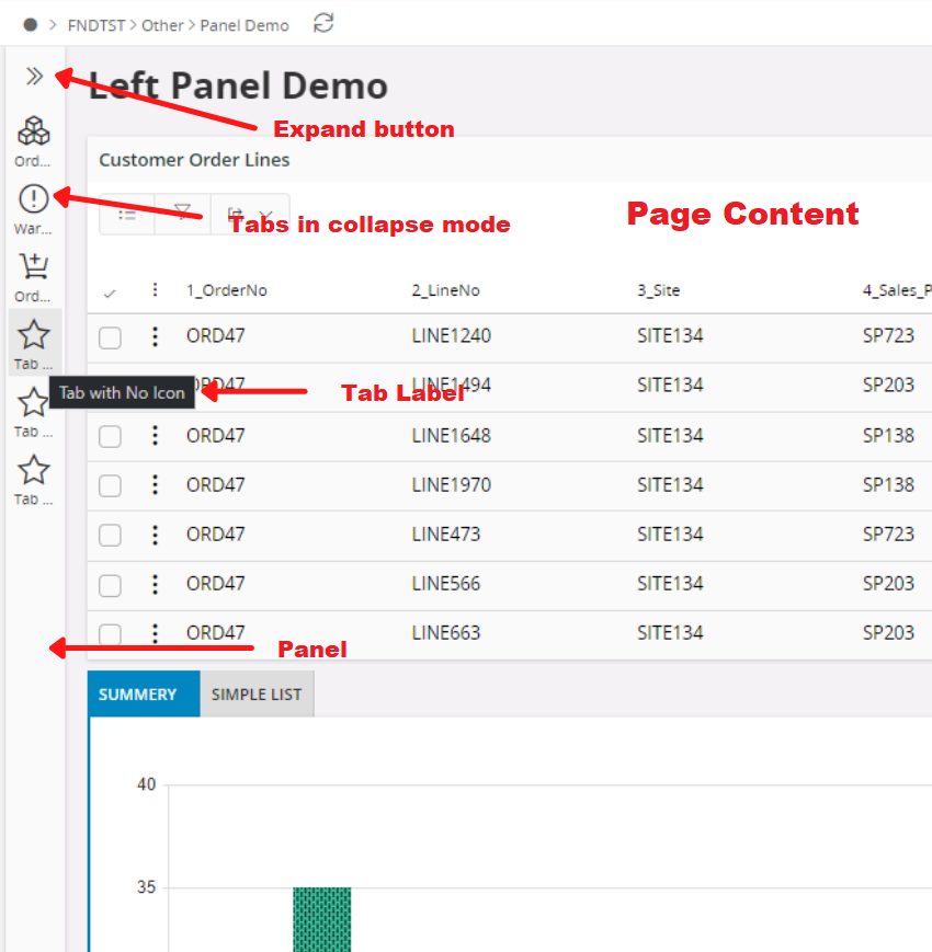
Figure 1 - Collapsed Panel control with tabs
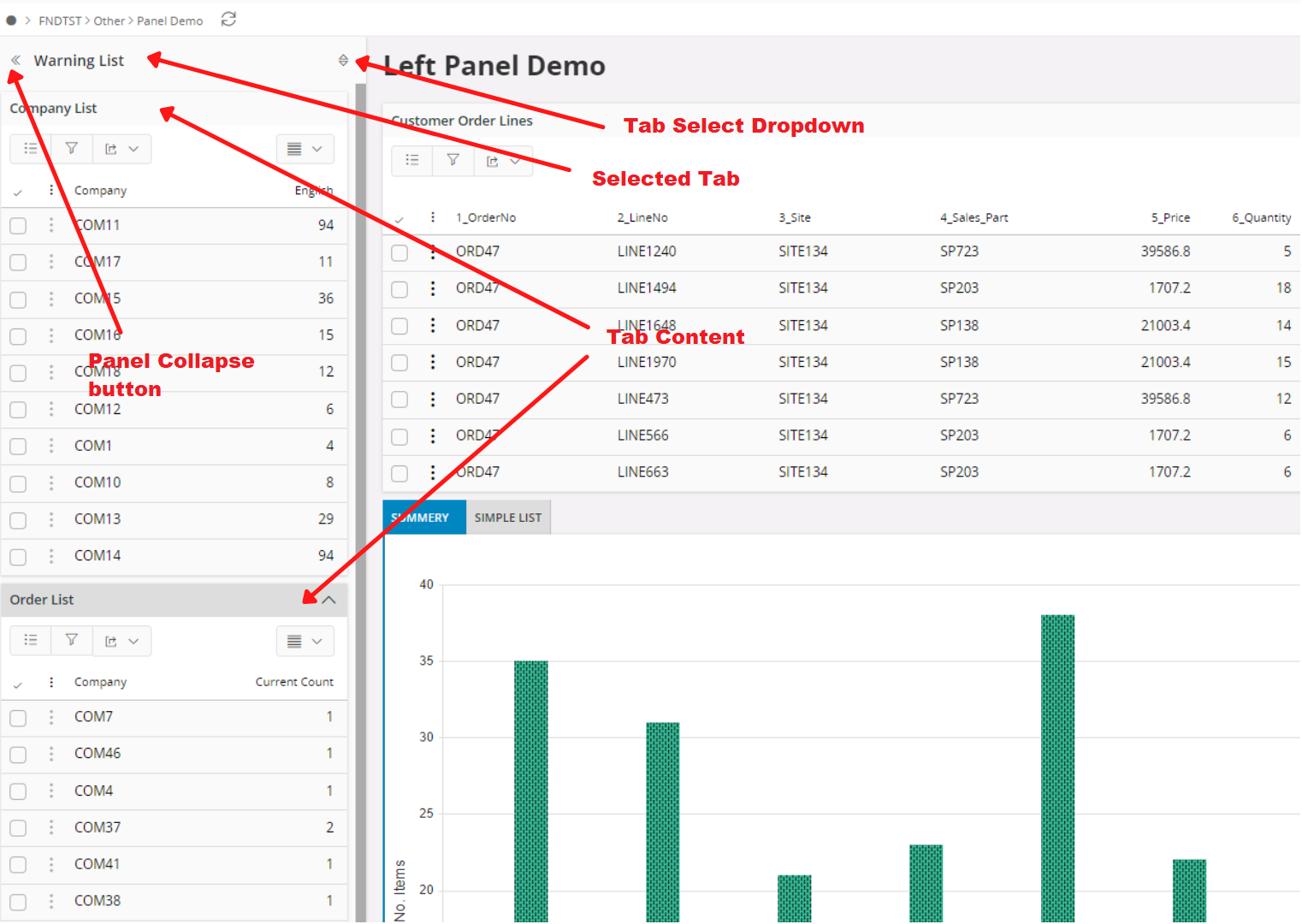
Figure 2 - Expanded Panel control with tabs
Variations
None.
When to use
Panel can be used to display Tab control in parallel with the page content. Panel can only have tab control and once used any component inside the tab control can be used in the panel.
How to use
  panel {
      tabs {
         tab {
            label = "Unassigned Jobs";
            ... // tab content goes here
         }
      }
   }
Limitations
- A page can have only one panel and will be positioned left after the navigator.
- Only tab control can be used inside the panel and using nested tabs are not supported.
- Panel can not be used with the Record Selector or Tree Controller.
Example
Below is an example of the tab control in use:
 panel {
      tabs {
         tab {
            label = "Unassigned Jobs";
            icon = "task";
            list TestList;
            list LineList;
         }
         tab {
            label = "Exception List";
            icon = "alert";
            list LineList;
         }
      }
   }
Example 1 - Panel control example