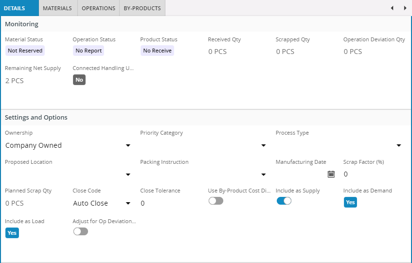
Tab
Tabs are analogous to the dividers in a notebook or the labels in a file cabinet. Use the tab control to define a set of tabs that each holds certain content.

Figure 1 - Tab control with four tabs
Variations
None
When to use
Use the tab control when you have a lot of related content that you want to access in close proximity to each other but the content does not need to be visible at the same time.
By always hiding the content of all but the selected tab, the tab control limits the amount of visual information that the user would otherwise have to process, leading to a cleaner page layout.
Limitations
A tab control can be placed directly on a page or in an arrange block. Other uses, like nesting a tab control inside another tab is not allowed.
How to use
Use the tab control to define one or more tabs and their content.
tabs {
    tab {
        label = "My first tab";
        ... // Content of first tab goes here
    }
    tab {
        label = "My second tab";
        ... // Content of second tab goes here
    }
}
Keywords
None
Properties
Below is a list of properties that can be used to customize the control.
Example
Below is an example of the tab control in use:
tabs {
    tab {
        label = "Competency Group";
        group CompetencyGrpGroup;
        list CompetencyList(CompetencyArray);
        list GroupList(ChildCompeGrpArray);
    }
    tab {
        label = "Assigned Persons";
        list CompeAssignedPersonsList(PersCompeProfArray);
    }
}
Example 1 - Tab control example