Map
Maps are used to display locations. The map control has 3 different modes, small map mode(left-panel), full-screen mode and page mode.
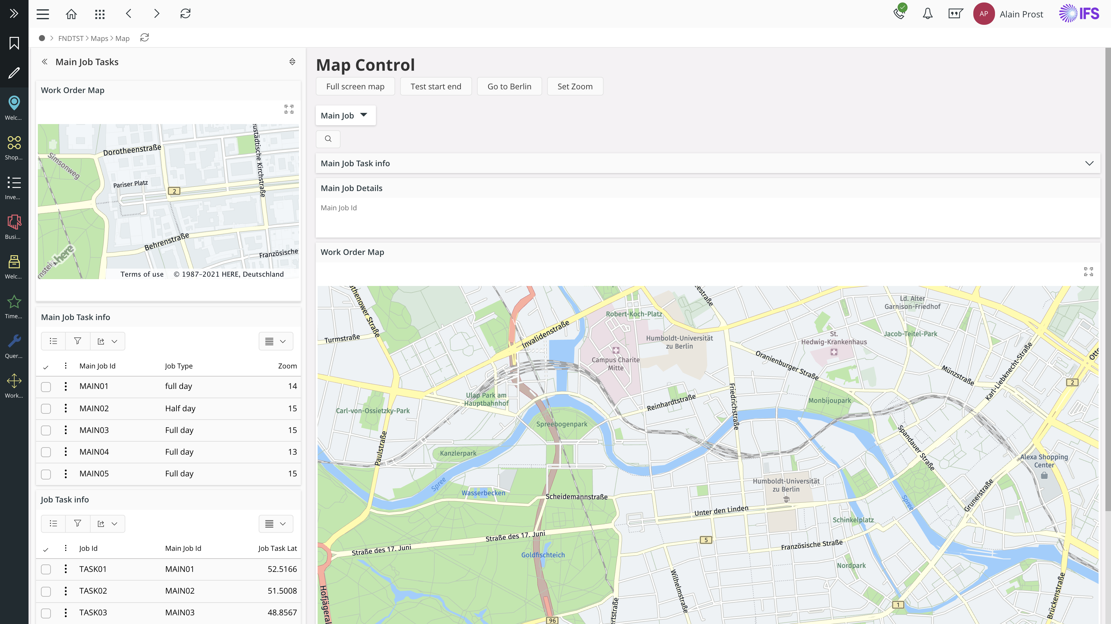
Figure 1 - Main view
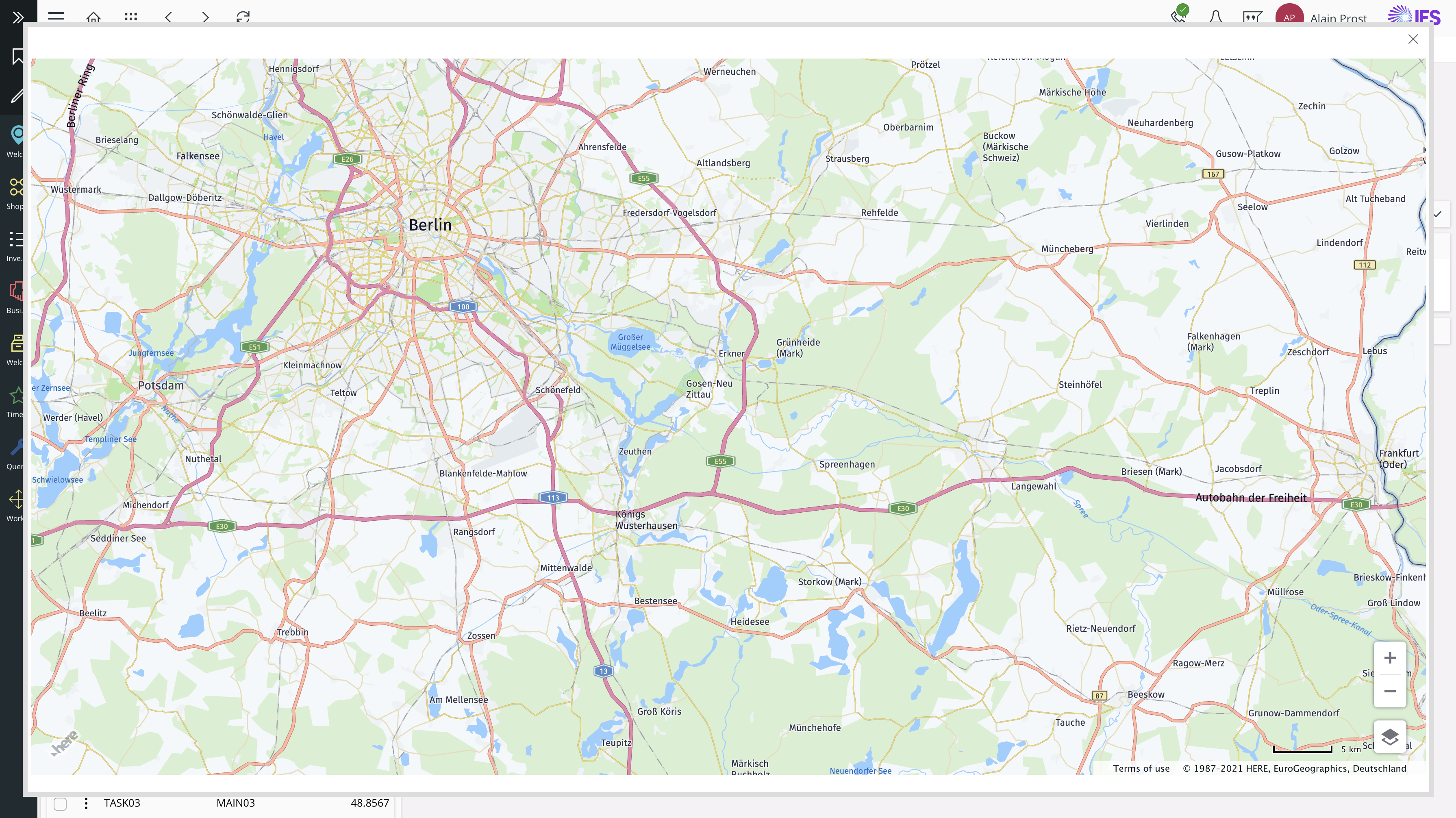
Figure 2 - Full screen view
Map provider for map control Is Here Maps. Since it’s a paid service, the purchased license key should be configured before obtaining the service. More details can be found via this link - https://developer.here.com/documentation/maps/3.1.28.0/api_reference/index.html
Functionalities are as follows.
- Pin a specific location
- Pin multiple locations
- Route calculation with starting and end points
- Drag and drop function for pins
- View polylines with starting and end points
- Information cards for pin
- Search functionality (search Context)
Default features of the map
- Full screen feature is built into the map
- Zoom in & out feature
Map can be put to left panel and main page. It is recommended to add a smaller size map to be used in the left panel.
When to use
Use the map control to pin a location(s), To display a route from start to finish or to display an area in a map. Route calculations, location details, polyline feature available to see
Limitations
Aurena Map Control
The new Aurena map control is only supported for the Service Dispatch Console in this release. Pre-existing map visualization capabilities are not affected by this new feature.
Here Maps is the only map provider that the new Aurena map control supports in this release. The pre-existing map visualizations used in other modules of IFS Cloud remain untouched and still support the map providers used previously.
How to use
Use map control for the following functions.
Pin a location
Use map control to pin a location. Pin consists of the drag and drop feature.
Multiple pins
Multiple pins can be displayed on one screen.
Routes
A route can be displayed on a map starting from a specific location to the end location.
Multiple routes
Multiple routes can be displayed on a single map.
Properties
Below is selection of the properties that can be used to customize the control
| height | |
|---|---|
| Description | Defines the height of the map |
| Values | Small | Medium | Large | Auto |
| mapzoomlevel | |
|---|---|
| Description | Defines the level of zoom in map during the initial loading |
| Values | AttributeRef (which contains value between 0-20) |
| label | |
|---|---|
| Description | Defines the label to be displayed |
| Values | String |
| location | |
|---|---|
| Description | Defines the location |
| Values | Geographical coordinates |
| card | |
|---|---|
| Description | Defines the card when clicked on pin |
| Values | Card name |
| pinstyle | |
|---|---|
| Description | Defines the icon style for the pin |
| Values |
| move command | |
|---|---|
| Description | Makes the pin able to drag and drop |
| Values |
Examples
Follow the steps below to add map control.
Defining the map
Map can be defined using Function or array. In this example,
map WorkOrdersMap for TstMainJob {
label = "Work Order Map";
location {
latitude MainJobTaskLat;
longitude MainJobTaskLon;
}
height = large;
mapzoomlevel = Zoom;
}
Defining the initial map focus location
The map area to display during the initial loading stage can be set with below properties.
latitude MainJobaskLat;
longitude MainJobTaskLon;
Defining the size and zoom level of the map
Size of the map and the zoom level can be set by changing below parameters
height = large;
mapzoomlevel = Zoom;
Height has the following properties: small, Medium; large; Auto
Mapzoomlevel should have an attribute name which contains an integer zoom level between 0-20
Pin
Define a pin in the map using the following format:
pin JobTaskPin using GetJobTasks(MainJobId) {
label = "Job Task";
card JobDetails;
latitude JobTaskLat;
longitude JobTaskLon;
tooltip {
field JobTaskLat;
field JobTaskLon;
}
pinstyle UnAssignedJob = [true];
move command {
execute {
success("${StateProp}");
}
}
command SetLocation;
Different pin icon styles are as follows.
Unassigned Tasks;
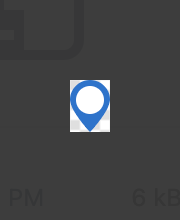
Figure 3 - Pin unassigned
pinstyle UnAssignedJob {
  label = "Text";
  icon = "unassigned-task";
  emphasis Complementary6 = [true];
 }
Assigned Tasks;
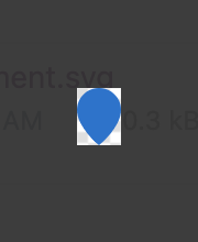
Figure 4 - Pin assigned
pinstyle AssignedJob {
  label = "Text";
  icon = "assigned-task";
  emphasis Complementary9 = [true];
 }
Resource;
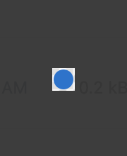
Figure 5 - Pin resource
 pinstyle Resource {
  label = "Text";
  icon = "resource";

  emphasis Complementary4 = [true];
 }
Start or End;
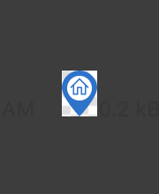
Figure 6 - Pin start/end
 pinstyle Startend {

  label = "start or end";
  icon = "start-or-end";
  emphasis Complementary4 = [true];
 }
Drag and drop function
The pins can be dragged and dropped. Users can use simple drag and drop interaction to change the position of the pin.
move command {
execute {
success ("Pin Moved");
}
}
Card
A card is a part that shows additional info of the location.Can be opened when clicked on a pin and can close upon clicking the close button.
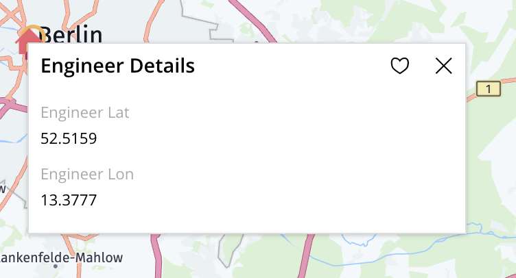
Figure 7 - Card
Should be defined under the pin
pin EngineerPin using GetEngineers(MainJobId) {
label = "Engineer";
card EngineerDetails; }
Route
Route can be defined as follows
polyline JobTaskRoute using GetRoutes(MainJobId) {
label = "Text";
startlocation {
latitude RouteStartLat;
longitude RouteStartLon;
}
endlocation {
latitude RouteEndLat;
longitude RouteEndLon;
}
}
Polyline
Defining the polyline
Polyline can be defined as follows.
route JobTaskPolyline using GetPolylines(MainJobId) {
label = "Text";
startlocation {
latitude PolylineStartLat;
longitude PolylineStartLon;
}
endlocation {
latitude PolylineEndLat;
longitude PolylineEndLon;
}
}