Radio button (radio group)
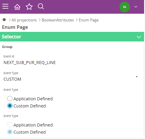
Radio buttons (radio group) is a client control that can be used to generate radio buttons from a enumeration field with few items.

Figure 1. Radio button on mobile device.
Variations
None.
When to use
Use radio buttons (radio group) client control instead of a field, when there are a few number of items in the enumeration field.
Radio buttons (radio group) can be placed on a group.
How to use
Add the radio buttons (radio group) control inside a group.
group <group_name> {
    ...
    radiogroup <radiogroup_name> {
        ...
    }
}
Limitations
It is advised to use the radio button (radio group) client control when there are less number of items. Radio buttons always show vertically one after the other. A radio group can only be generated inside a group, and is not allowed inside of a list.
Properties
Below is a list of properties that can be used to customize the control.
defaulttoprevious | editable | label | required | showlabel | size | validate | visible
Example
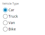
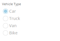
Below are examples of editable and non-editable radio buttons.

Figure 2. Editable radio button.
//Example code for editable radio button
   radiogroup VehicleEnum {
      label = "Vehicle Type";
      editable = [true];
   }
Example 1. Editable radio button.

Figure 3. Editable radio button.
//Example code for non-editable radio button
radiogroup VehicleEnum {
      label = "Vehicle Type";
      editable = [false];
   }
Example 2. Non-editable radio button.