State Indicator
A state indicator client control shows the current state and the finished progress up to the current state, using a progress bar. When used on the page level it shows the state of selected record in the page.

Figure 1 - Current state and progress
To view all the states in the process, click on the name of the current state, and a drop down menu opens containing all the states.
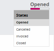
Figure 2 - Available states for the process
Variations
None.
When to use
Use a state indicator client control to indicate the current state of a state machine. On the page level it is positioned in the top right corner of the page.
A state indicator is a page level component, and it does not have dependencies with other components. It can be used in any page, and is not dependent on the content of the page.
How to use
Declarative of the state indicator can be implemented in three ways.
By defining only a name for state Indicator
page  using  {
   stateindicator StateIndicator;
}
Add the state indicator to the page level. Remember to give the state indicator a name as in the above pattern.
Example is given below:
page StateIndicatorPage using Orders {
   stateindicator OrderStateIndicator;
}
By defining states in the state machine with separate colors and completed percentage value.
page StateIndicatorPage using Orders {
   stateindicator OrderStateIndicator;
}
 stateindicator OrderStateIndicator for Order {    state “Opened” {       emphasis StateOpen = [Objstate = "Opened"];    }    state “Cancelled” {       emphasis StateCancelled = [Objstate = "Cancelled"];    }    state “Invoiced” {       emphasis StateInvoiced= [Objstate = "Invoiced"];    }    state “Closed” {       emphasis StateClosed = [Objstate = "Closed"];    } }
The completed percentage is shown as the completed part of the progress bar. Emphasis is used to give different colors to different states.
By grouping states
stateindicator OrderStateIndicator for Order {
   state “Opened” {
      completed = 50%;
      emphasis StateOpen = [Objstate = "Opened" or Objstate = "Invoiced"];
   }
   state “Closed” {
      emphasis StateClosed = [Objstate = "Cancelled" or Objstate = "Closed"];
   }
}
It is possible to group states by combining several states into one. The name of the group can be either a existing state name or a another new state name. When states are grouped, the same state name is shown to all the states in the group.
Below is another example with state values that consist of more than one word:
stateindicator OrderStateIndicator for Order {
   state “In Progress” {
      emphasis StatePreliminary = [Objstate = "InProgress"];
   }
   state “Completed” {
      completed = 50%;
      emphasis StateInProgress = [Objstate = "Completed"];
   }
   state “Invalid” {
      completed = 100%;
      emphasis StateClosed = [Objstate = "Invalid"];
   }
Limitations
The state indicator client control is read-only, and is only used to indicate the current state. It is not possible to change or set states using the state-indicator.
Properties
Below is a list of properties that can be used to customize the control.
Example
This section is still under construction. The completed version will be available in IFS Applications 10 Update 6.* *
Below is an example of how a state indicator is used to....
stateindicator MyState for TstOrder {
   state "Cancelled" {
      completed = 0%;
      emphasis StateCancelled = [Objstate = "Cancelled"];
   }
   state "Opened" {
      completed = 10%;
      emphasis StateActive = [Objstate = "Opened" or Objstate = "Closed"];
   }
   state "Invoiced" {
      completed = 40%;
      emphasis StateInvoiced = [Objstate = "Invoiced"];
   }
   state "Closed" {
      completed = 100%;
      emphasis StateClosed = [Objstate = "Closed"];
   }
}
Example - State indicator example code